Communicating results with scientific graphs
Graphs are great visual communication tools that, when used correctly, can consolidate large amounts of data to help identify patterns and relationships for an audience. Whether they are included as part of a scientific article, a presentation, or a poster, scientific graphs should help you to communicate the key messages or findings of your investigation.
Before you create a graph you should consider three things:
1. Do you need a graph?
Sometimes results can be easily summarised in a sentence or two, or by using a simple table. If you have a large number of categories with a variety of measurements, a table may be more appropriate to neatly display results.
2. What types of variables do you have?
Knowing the types of variables in your data and the statistical analysis you have performed will guide you when deciding what type of graph to use.
3. What is your message?
Graphs should clearly communicate a message to your audience. Therefore, you should only include data that will help communicate your message (while ensuring you’re not misleading your audience). You should keep this message in mind when creating and formatting your graph.
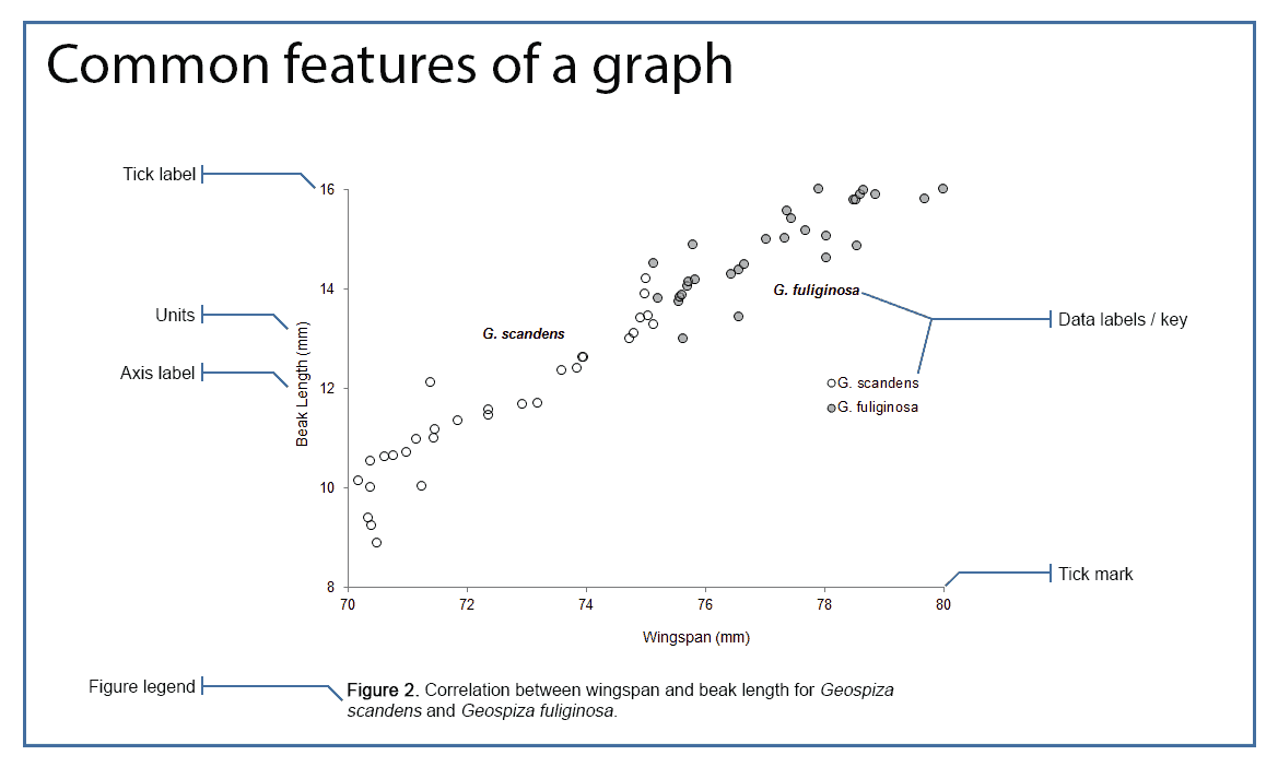
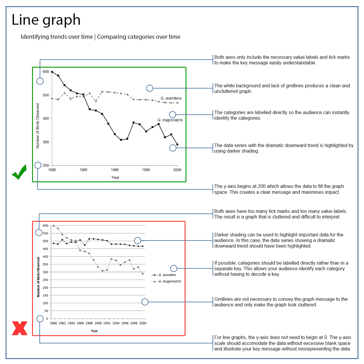
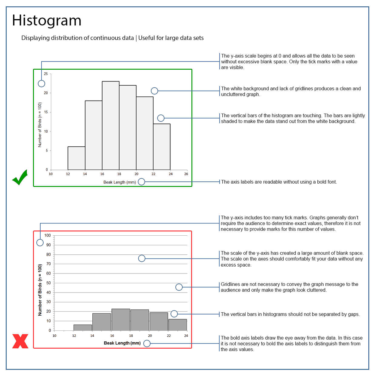
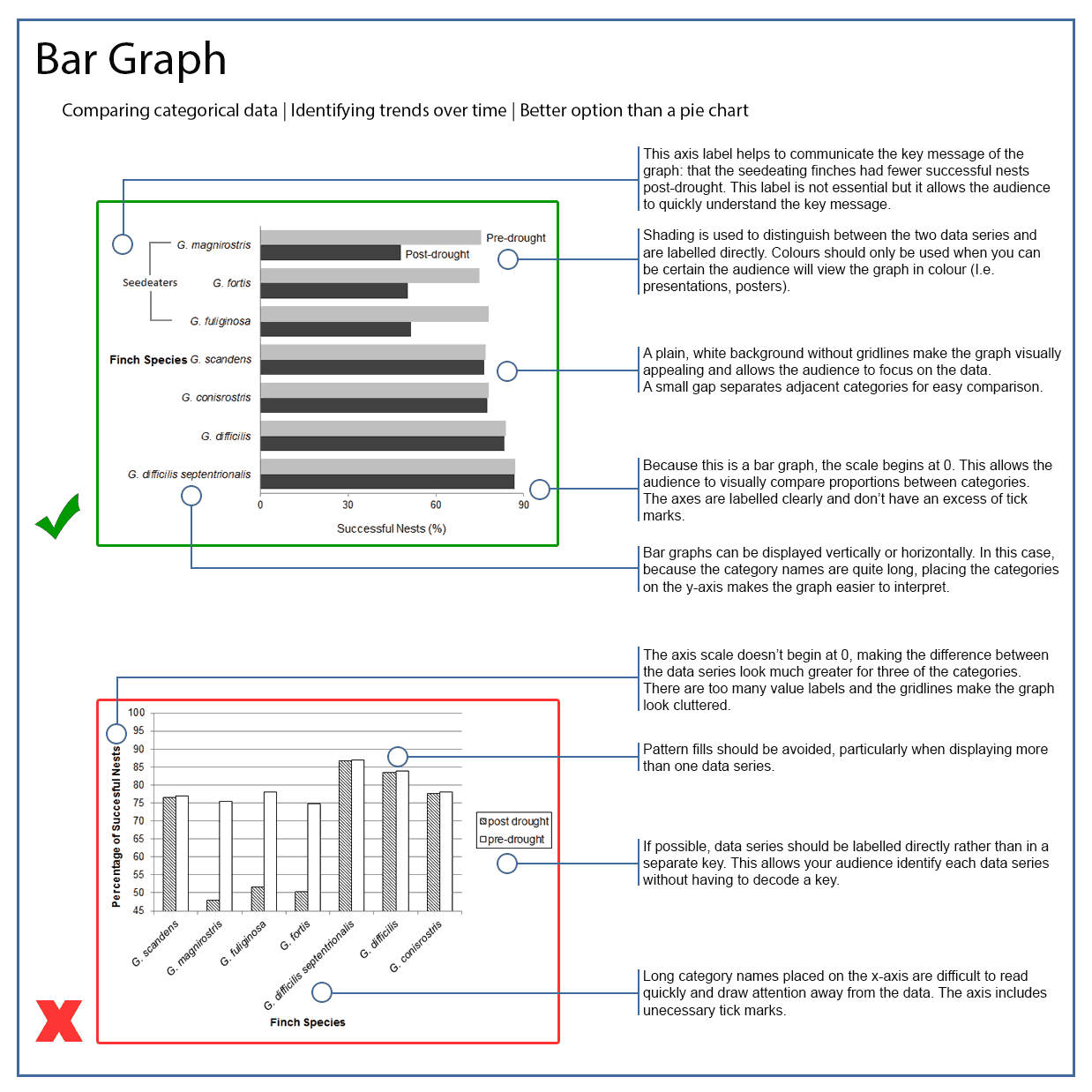
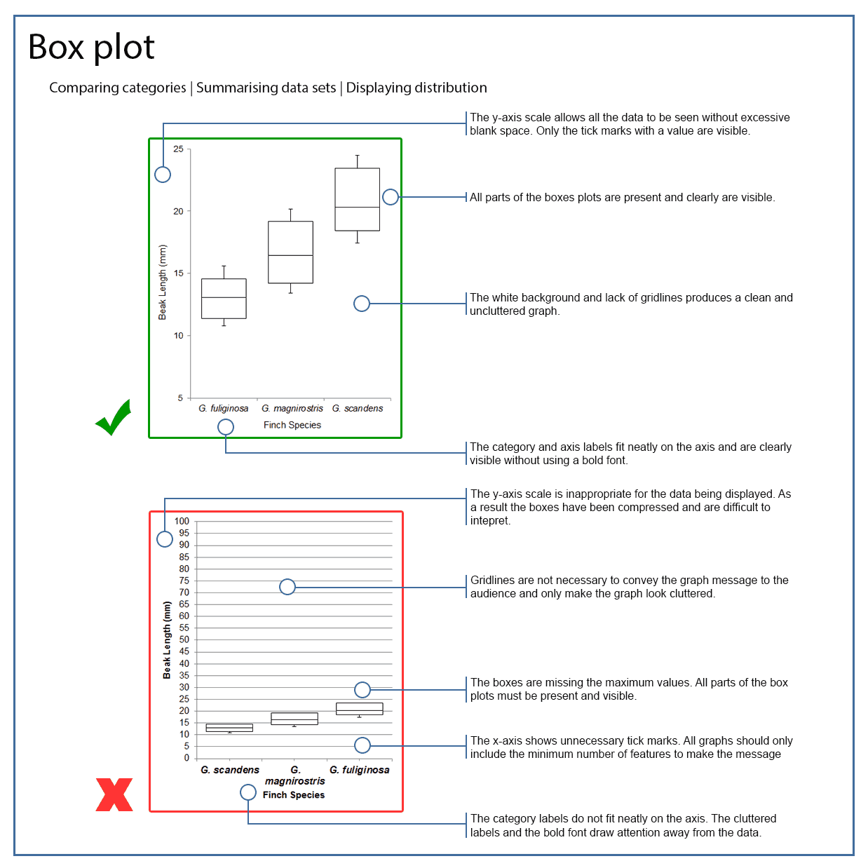
Graphs share common features that help your audience to understand your key message.
As a general rule, you should ensure that all of your figures for scientific articles or lab reports can be easily interpreted when printed in black and white. Colour can be used if your audience is likely to view the graph in colour (i.e. when viewing a poster or presentation) or if it essential to communicate your message.
How to display your data

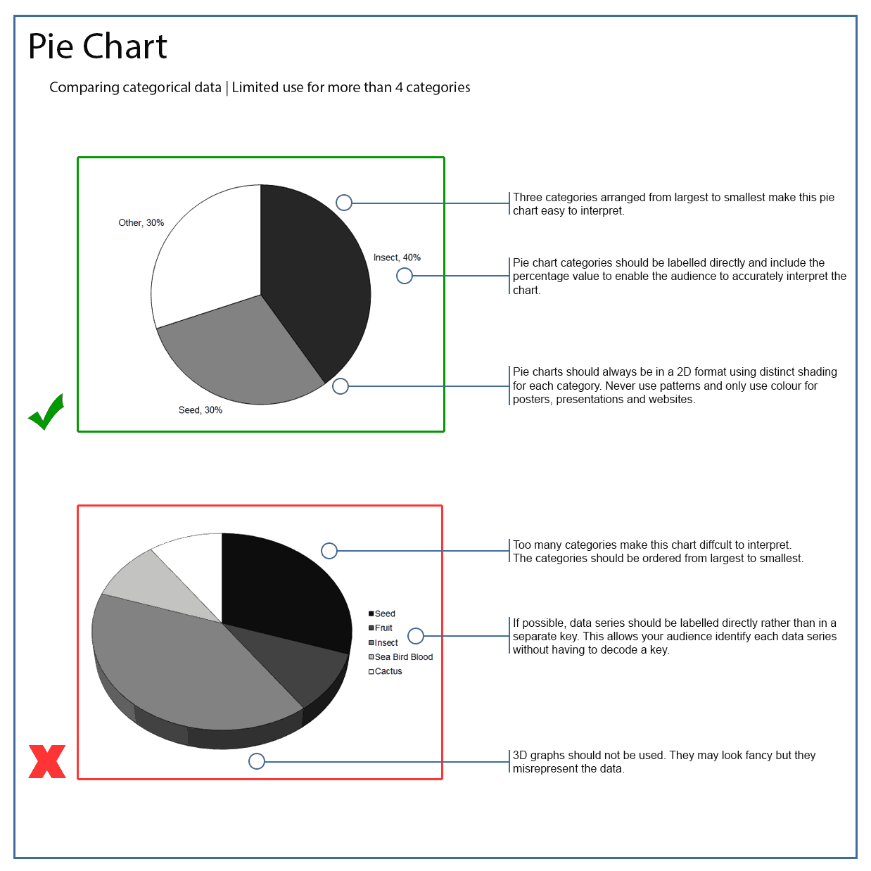
Pie charts are rarely used in scientific articles, but they can be useful when communicating with the public. You should check the requirements of your assignment with your lecturer for guidance on how to display your data.
Types of variables
Continuous variable: Continuous variables are numeric measurements or observations that can include any number of values within a certain range. (E.g. temperature, time, weight, and concentration).
Discrete variable: Discrete variables are measured as whole units. (E.g. number of birds in a population, number of students in a class).
Categorical variable: Categorical variables describe a quality or a characteristic (E.g. Colour, species, sex, blood type).
Independent variable: The independent variable is the variable which you control or manipulate in your experiment, or the variable that you think will affect the dependent variable. Independent variables are placed on the x-axis of a graph.
Dependent or response variable: The dependent variable is the variable you think will be influenced by the independent variable. Changes in the dependent variable are observed or measured in relation to changes in the independent variable.
An experiment investigating the effect of light exposure on the rate of growth of a plant.
The independent variable is the amount of light exposure and the dependent variable is the rate of growth.
Should I use a table?
Sometimes a table will be more appropriate for displaying your data. Tables are great for displaying multiple variables, specific values, and comparing categories. A table will often require an audience to look up specific information to understand the data. Therefore, you should ensure your table is presented in a neat and logical manner.
It is important that you don’t just add all of your raw data to your tables. Similar to graphs, you need to consider the message in your data that you want to communicate to your audience. You may need to perform a statistical analysis on your data or summarise your results before adding the information to a table.
For large tables, you may need to shade alternate rows or highlight important details by using a bold font to allow your audience to read the table efficiently.
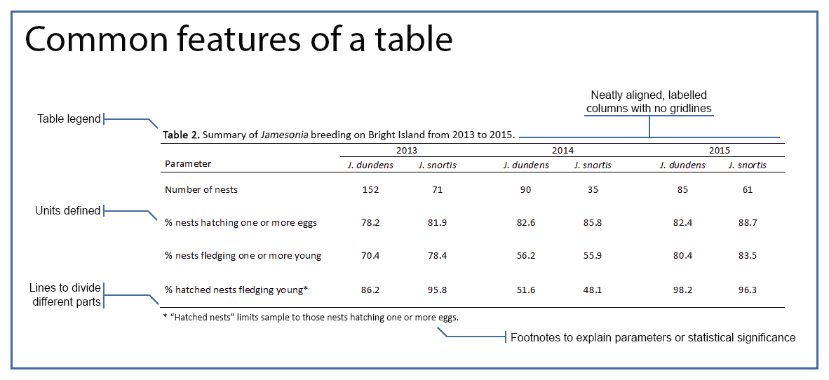
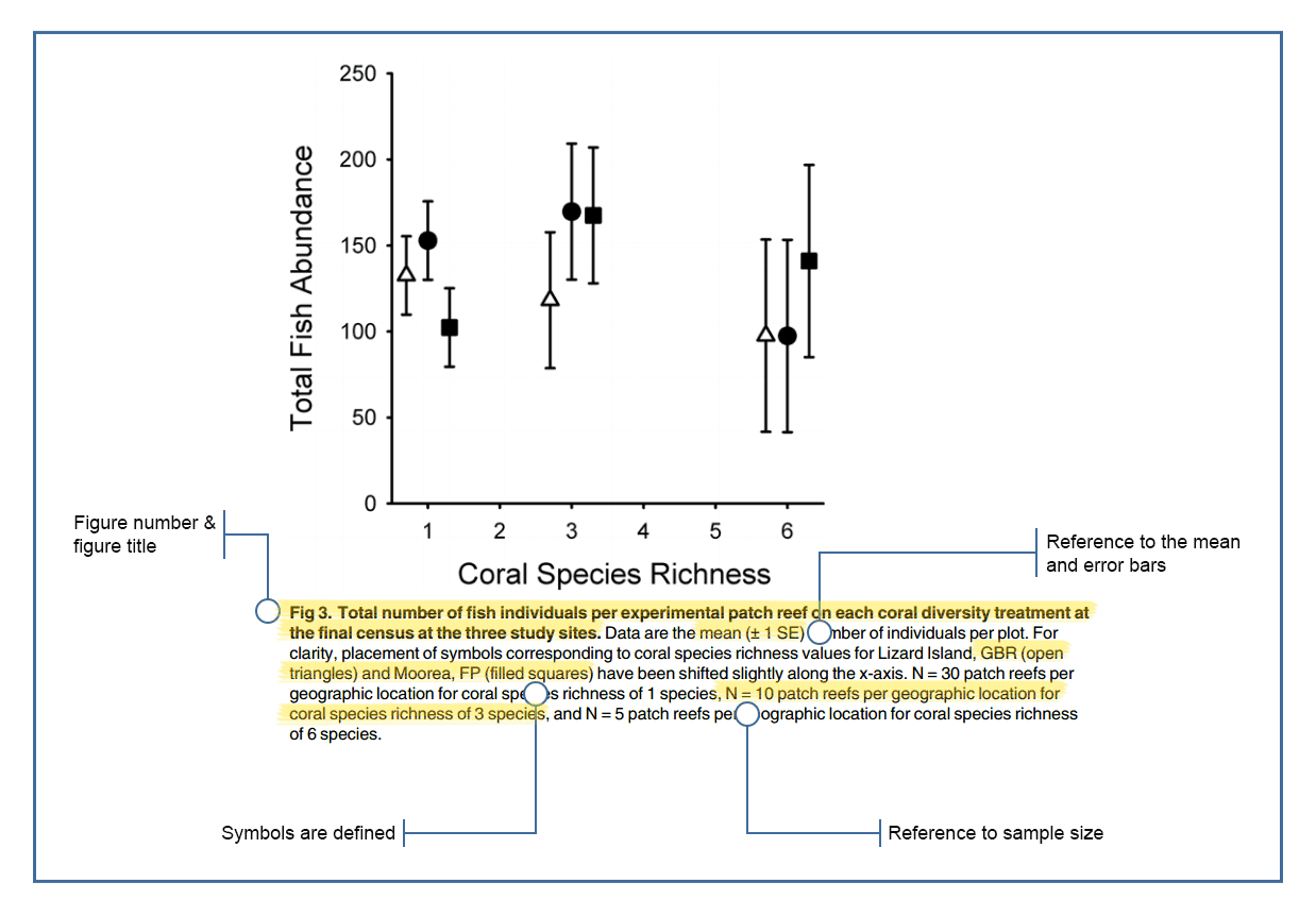
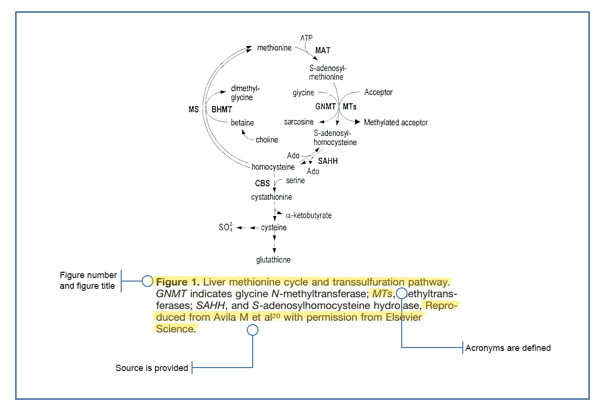
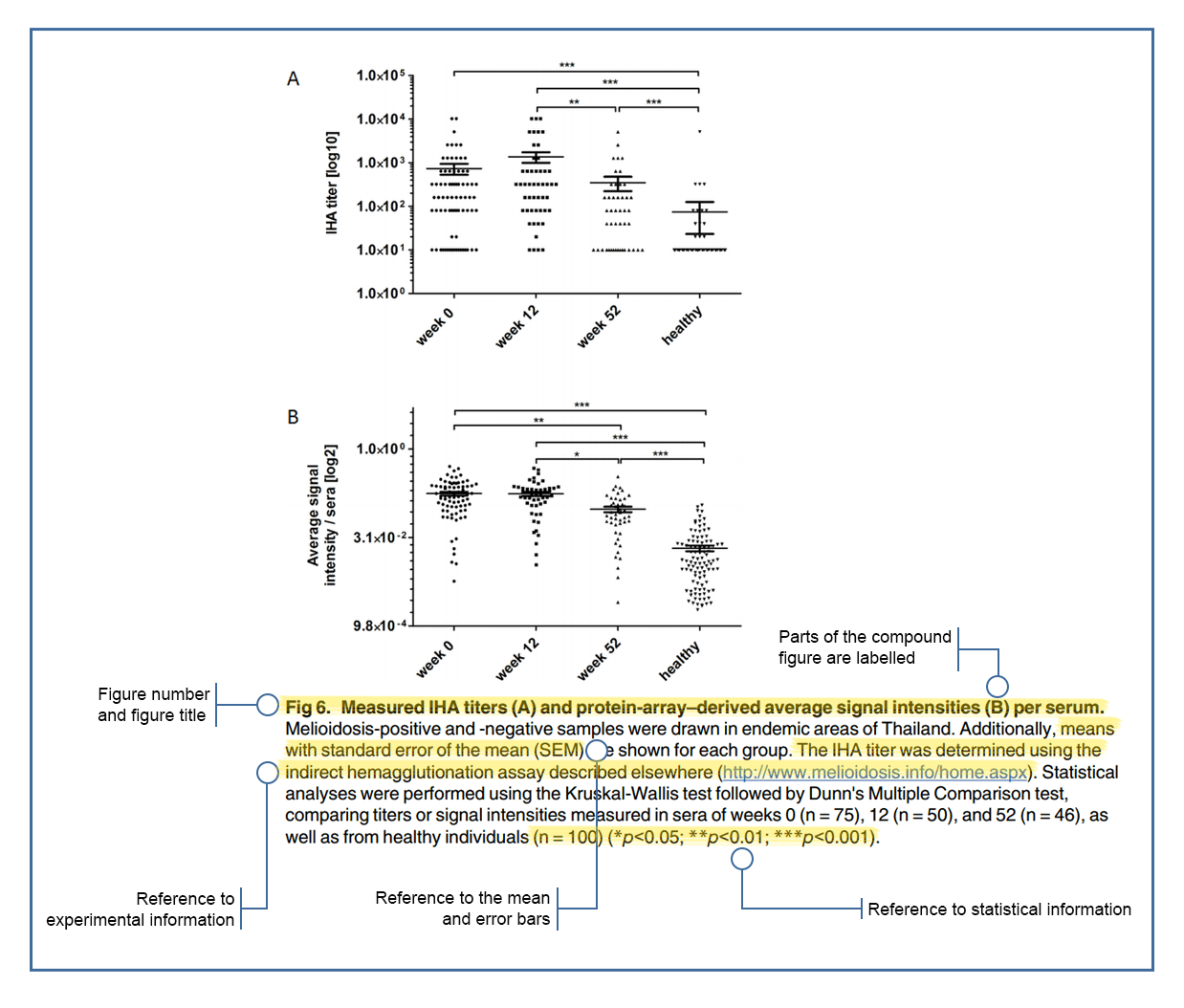
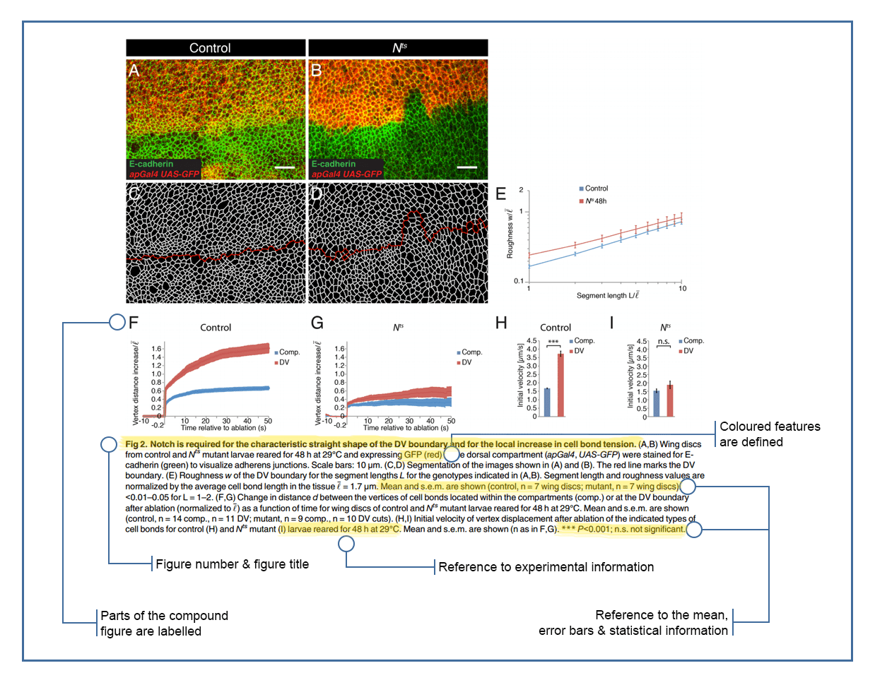
Figure & table legends
All of the tables and graphs that you create for scientific articles and lab reports will require a legend.
What is the point of a legend?
- Identifies the graph or table (E.g. Figure 1. or Table 1.)
- Informs your audience what the graph/table is showing
- Provides any information that may be needed to interpret the graph/table
- Some figure legends may need to include information on specific symbols or shading, the experimental methods, the error bars, or the sample size. For tables this information can be included in column/row headings or as footnotes.
The concise description in a table or figure legend should convey the key message of the table or graph to your audience without having to read the full article.
This module focuses on graphs and tables for use in scientific articles and lab reports. If you are designing a graph for a presentation or poster, you should refer to the relevant module for further design guidelines.
For detailed guidelines on creating figure legends, view the optional extras section below.
The essentials
Figure number (Figure 1 or Fig. 1)
You must refer to all figures in the main text of your report or essay. The figure number is used to allow your audience to find the figure you have referred to in your text.
Figure title
Figure titles can be descriptive or assertive.
A descriptive figure title briefly describes what the figure is displaying but lets the reader identify any trends or relationships, or is guided by the text you include in the results section. An assertive title can be used to identify a specific trend found in a graph or highlight the key message of a diagram.
Assertive titles can help your audience to quickly identify the key message contained within your figure but you should ensure your title does not mislead your audience or overstate your results.
Example 1.
Descriptive: Figure 1. Effects of dam construction on fish biodiversity.
Assertive: Figure 1. Dam construction results in loss of fish biodiversity.
Example 2.
Descriptive: Figure 2. Height distribution of two Eucalyptus grandis plantations in Queensland.
Assertive: Figure 2. Insect defoliation of Eucalyptus grandis reduces canopy height.
Figure legend examples
An Academic Explains


Useful links
Choosing the right graph
Extreme Presentation
Download PDF
Statistics for biology and agricultural science
by Ploughing Through Biometry
Visit website
Real chart rules to follow
by Flowing Data
Visit website