Designing and creating science infographics
What is an infographic?
An information graphic or ‘infographic’ is a visual communication genre that combines common icons, illustrations, minimal text, data visualisations, and information, to create an engaging narrative.
Infographics have multiple uses
An infographic simplifies a large amount of complex information into primarily visual messages, so an audience can read and understand them with ease. The simplicity of a science infographic can be helpful in communicating information to non-academic audiences through news articles, brochures, or posters; however, scientists can also use infographics to communicate their research with peers without the formalities of a journal article.
An infographic can:
- market or sell a product or brand
- inform
- entertain
- persuade an audience e.g. to take a certain action
- be a visual explanation of something
Infographics are generally not suitable for presenting results in scientific articles. For presenting results for scientific reports or articles, please refer to the displaying data module.
The following are not considered infographics:
- Any piece of writing with images included throughout – if there is more text than images, it isn’t an infographic
- Data visualisations (graphs) on their own are not infographics
(see CLIPS displaying data module) - Posters displaying research; they often rely on text and have a generic style
(see CLIPS poster module)
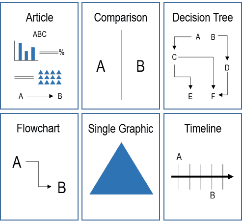
Types of infographic
Familiarise yourself with your topic
Once you have identified the topic of your infographic:
- Review existing infographics for that topic (there will probably be lots available)
- Look at what does and doesn’t work
- Consider how you could present your topic from a unique or unexpected angle, or by focussing on something the audience might not already know
- Consider if you can base your information around current or even controversial topics; some infographics designers do this (make sure it is appropriate for your topic!)
Example infographics
Consider your audience and focus
Once you’ve got a specific topic in mind, you need to determine your audience and the key focus and aims of your infographic.
Consider the target audience for your topic and how you define them. Does your audience know about your topic already, or do you want to raise awareness? What do they need to know about or “feel” about it? What do you want them to do with the information?
Determine your key message or focus for the infographic. Your scope should be narrow, so you can plan a narrative around a core message or piece of information. Keep this, and your audience, in mind throughout all other aspects of design and creation. Without a key message, your design will lack focus and look messy.
Scope your narrative
Consider how you will achieve your aims by communicating your key message with a story or narrative. For infographics, the narrative generally has three parts:
- The introduction or the ‘hook’. This will grab the attention of the audience, for example with a problem statement, and clearly indicates what the infographic is about.
- The body. This contains the bulk of your story and information, with different visuals centred on your key message. This section is where your research evidence shines.
- The conclusion. This section clearly indicates to the audience what they are meant to take from the infographic. It may also include a “call to action” that encourages the audience to do something.
Research your topic based on your key message.
Good information is the foundation layer of a good infographic. You will need a surprisingly large amount of information to make a good infographic.
Keep to your scope.
Too much information will overwhelm you and your audience; when researching your topic, keep the key message and aims of your infographic in mind. Review and discard information that will not help you tell your story relative to your focus.
Use quality resources.
It is vital that the sources you use are valid, so be critical when making these decisions. Read widely so you understand different perspectives and use the most up to date information. You should always use an original source, rather than relying on another author’s work that uses the same citation.
Be transparent.
By choosing a focus for your infographic, you create bias by not covering everything about that topic – this is ok as long as you aren’t misrepresenting or distorting information to support your message. Make sure it is easy for any reader to find all the sources you’ve used in your infographic by citing them at the bottom of your design.
Write a “script”.
To make things easier when it comes to designing, compile your research notes as you want them to appear throughout the narrative of your infographic. Note what pieces of information will be visualised. Any combination of data visualisations (graphs), icons, and graphics (images and illustration) can make up your design, but remember the focus is the images and not the text.
Sketch a layout
Once you have all your research, and a clear plan of the infographic, it’s time to start designing. Remember your layout needs a ‘hook’ at the beginning (or the most prominent part of the image), a body containing most of the information, and a conclusion. Don’t forget space for your reference list and attributions.
First, sketch your layout – this can be quite detailed. Consider the size, and length/width of the infographic. Looking at lots of other examples of infographics is really helpful at this point.
Once you’re happy, create a ‘wireframe’ or skeleton of your design in the program you are using to create your infographic. Now it’s time to start filling in your frame.
OR
There are lots of online options and tools for building infographics – you don’t have to do all the artwork or layouts yourself. Some of them are listed in the “Helpful links” part of this CLIPS page. Most charge a fee for full access to the tools and output methods but they will save you a lot of time and effort; they provide graphics and layouts ready made.
Write your text content
Your research notes should contain an outline of the text content for your infographic. Now is a good time to write the sections of text that will appear throughout your design.Keep the audience in mind. You want to pitch the content at the right level for them.When preparing the text, remember:
- keep it to a minimum
- include a title and if applicable a brief ‘problem statement’
- text should support the message, not contain it
- very large data points can be presented using text if this makes the message clearer
Visualise your information
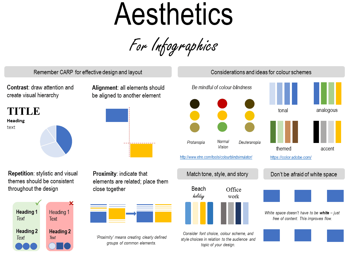
By now you should have a good idea of what data visualisations, icons, and graphics you want to use to illustrate your story. You can exercise a lot of creativity in your design, but here are are some guiding principles to follow to ensure you best communicate your message to the audience.
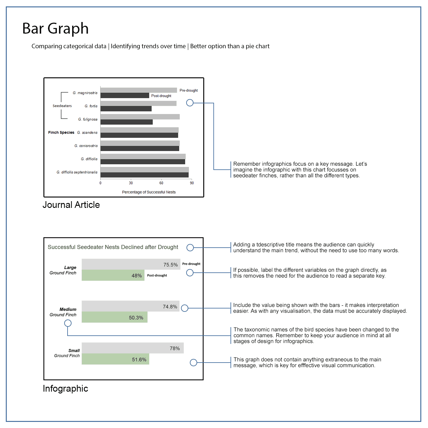
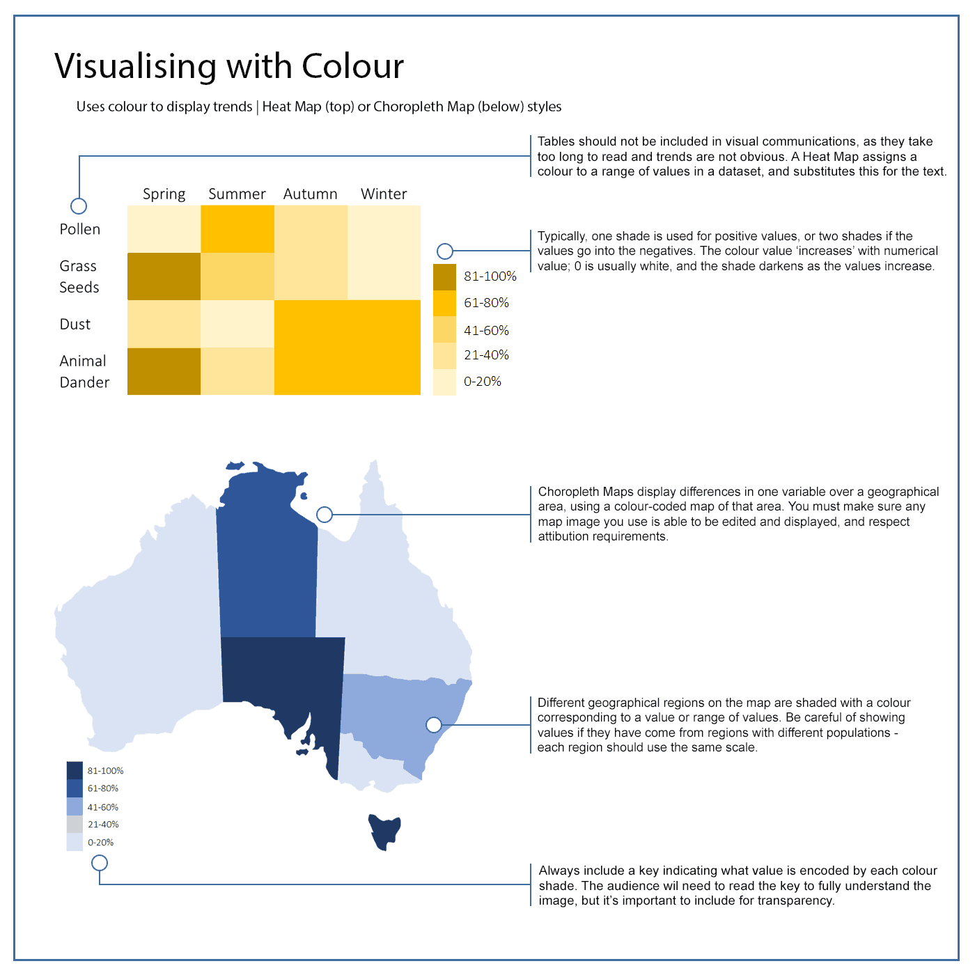
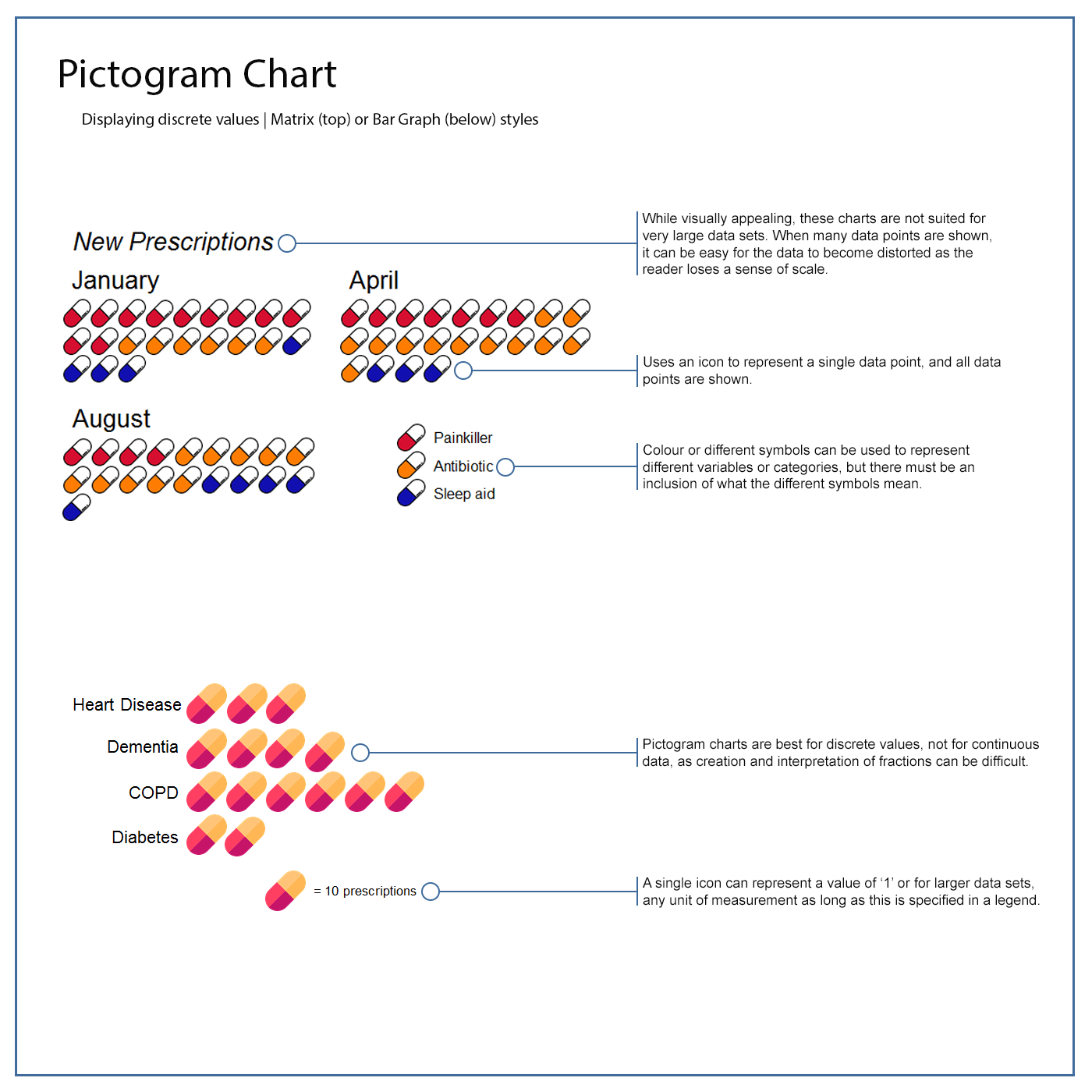
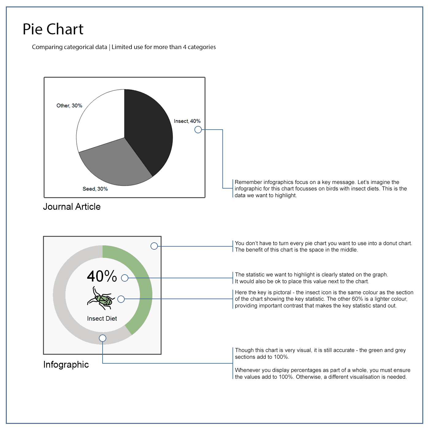
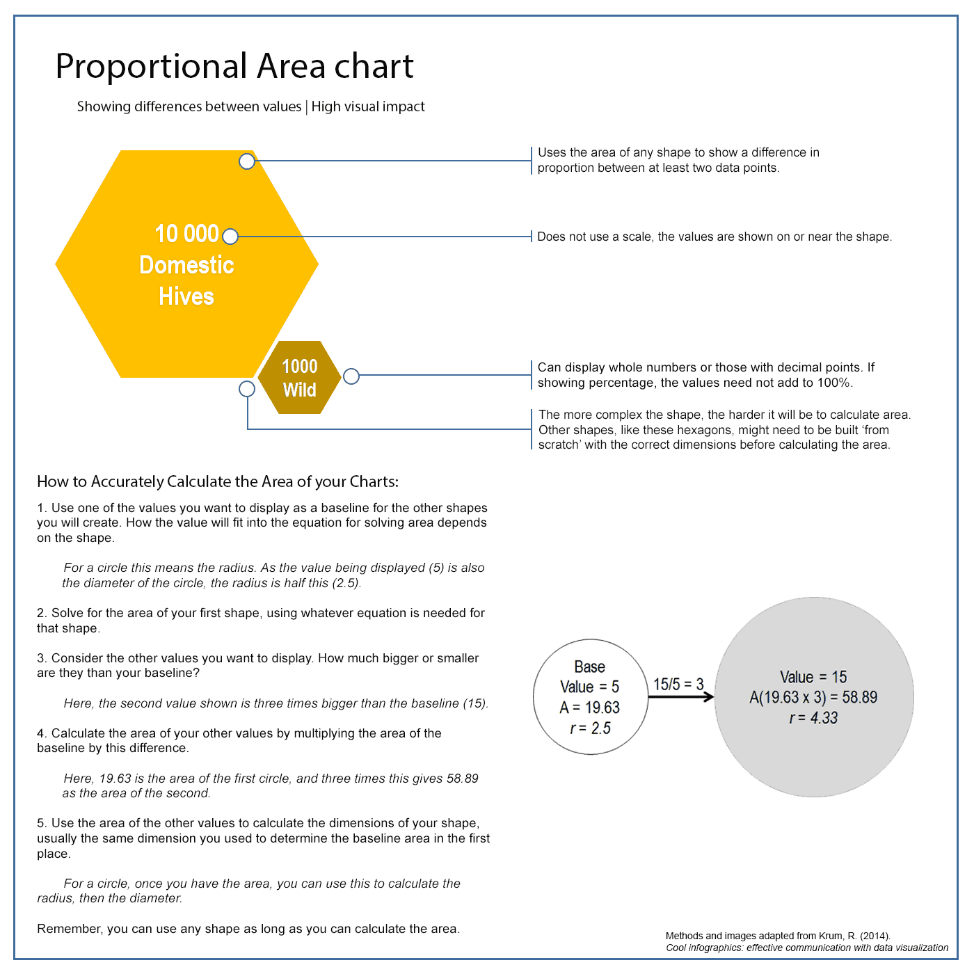
Data visualisations can be graphs, like pie charts or bar graphs, or a less common type like a pictogram chart. The three most important principles of using data visualisations are: accuracy, consistency, and clarity.
Accurate data visualisations use the right type of visualisation, and present the data correctly, or without distortion.
Consistent data visualisations use the same formatting, scale, and style across the whole infographic. This is another way of ensuring accuracy, as graphs with different scales or formatting can distort the data.
Clear data visualisation stems from streamlining your design to only show the necessary information. You want to highlight the trend or message in your data, not show everything you know. You can do this by labelling data points directly with the value or name, including a short summary of the trends instead of a figure legend, and using design principles like contrast to highlight main points.
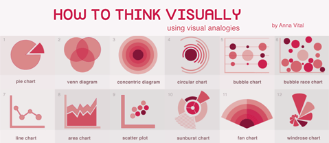
Types of visualisations

Using icons
Any image that is used to visually communicate a concept can be described as an ‘icon’. Icons are useful for communicating concepts more efficiently than with text, provided they are used properly. Just be careful – audiences can interpret icons differently, depending on their cultural background, level of information, and their personal experiences.
Icons can literally depict a concept in a visual medium. They can also be indicative of a concept without actually depicting it. Similarly, icons can symbolise something by being visually unrelated to the concept. In this instance, there is a constructed meaning that connects the two. Take a look at the icons below.

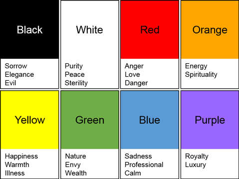
Using colour
Colours can also be interpreted differently by different audiences. A single colour can have multiple meanings in different cultures and situations. They are often linked to emotion, so being aware of the ways colour links with your topic and target audience can help ensure your message has maximum impact.
Part of designing a professional infographic and achieving the project aims is to plan how to promote or ‘market’ it to you target audience. Without it the impact of any infographic will be reduced. You can start to think about how to promote your infographic when you are still designing it, in particular thinking about the audience, context, story, and creating visuals.
What context will the infographic be viewed in?
Both online and in-print infographics need context, so consider where your audience is most likely to see your infographic, and other places that you could promote it and get the message out.
Getting your audience’s attention.
You can plan for sharing your infographic on social media when you are preparing your text content, planning your layout, and creating the visuals. What is something attention-grabbing, unexpected, or interesting in your infographic? Including a summary of a statistic from your infographic, for example in a tweet, is one way of promoting your infographics. Including a condensed or smaller version of a related image will help get your audience’s attention.
Note that marketing infographics requires a specific set of skills outside the scope of CLIPS, but it can still be useful to consider during the design phase. Consider your assessment requirements, and always follow these first.
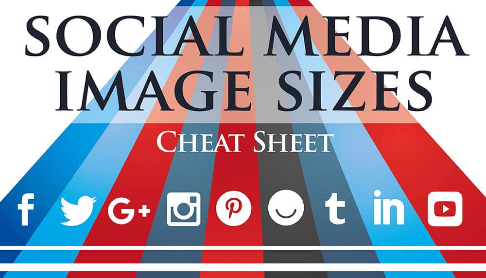
For a digital infographics, this could mean websites, blogs, or social media accounts relevant to your topic. Social media is a great way to promote infographics, because there are multiple platforms you can use with a large number of users, so you increase the chances of reaching your target audience.
For print infographics, consider where you’d want to post the infographic – perhaps in the doctor’s office, local café, gym, or school. Again, consider your audience.
Useful links
Sites that will help you build an infographic
Piktochart – Create easy to use infographics
Canva – Easy drag-and-drop infographic creator
Easel.ly – Create and share visual ideas
Infogr.am – Charts and infographics the easy way
Venngage – Make Infographics for free
Reference sites
Cool Infographics by Randy Krum
You can also search for the book ‘Cool Infographics’, by R. Krum.
Pinterest.com
Pinterest is a great site to view a wide range of infographics
Mordy Golding for Lynda.com
The five keys to a great infographic – Watch video
Amy Balliett for Lynda.com
Course: Infographics Fundamentals – Visit Lynda.com (requires UQ login)
Dustin Wax for Lifehack
Design Better with CRAP – View blog
Steven Bradley
Icon, Index, and Symbol – Three Categories of Signs – Visit website
For more information on using icons.
*Note that what the author calls ‘signs’, we have called ‘icons’.