CLIPS for University

Communication skills for science students

CLIPS for University is designed to provide you with some of the essential information on communication skills that you will need during your science degree.

The modules align with the variety of assessment items found within the sciences, from short-answer questions to PowerPoint presentations.


Useful links

English communication for scientists
by Nature Education

Communicating science resources
by the American Association for the Advancement of Science

Digital Essentials
by The University of Queensland Library

Connect with us

The CLIPS team are always keen to hear about how you are using the CLIPS resources and open to suggestions to improve the resources.

Meet the CLIPS Team

Get in touch


Referencing for scientific communication

Communicating through references

Referencing in scientific publications plays an important role in communicating with a scientific community.

Credibility

Your credibility as a scientist is a key factor in effectively communicating your message to an audience. For example, an audience may be less likely to be persuaded by your arguments if they don’t consider you to be credible. Using references in your work contributes to your credibility by demonstrating that you have thoroughly researched your topic.

It is important to consider the quality of your references.

  • Are you referencing Wikipedia or dubious sources of information?
  • Are you referencing the most current research?
  • Are your references relevant to your own research or analysis? (I.e. Is there a strong link between your explanations/arguments and your references?)
  • Don’t try to increase your reference list with references that are only vaguely relevant to your research.

Constructing your argument

Your references play a crucial role in how you develop your argument or your message. By using references, you can construct a story that integrates your own research into the existing body of evidence. Your references can be considered as another form of data that you use to help persuade your readers that your data and analysis are valid.

You can also use references to highlight differences between your results and existing research. You are able to question a particular body of work, expressing doubts over the results or methods, or simply indicate that your study produced conflicting results and suggest that further research may be required.

Researching your topic

View the UQ Library playlist

UQ Library guides

The UQ Library website has a range of subject guides to help you find resources for specific fields. The guides identify relevant databases, journals, books, and web resources.

View the UQ Library research guides

Useful links

Referencing styles
Some lecturers may ask you to use a particular style for your assignments. Referencing styles indicate how you should format your in-text references and reference list. Whichever referencing style you use, it is important that you stay consistent – don’t use multiple styles in a single document.

How to reference
Paraphrasing, summarising, and quoting are the three main ways that you can include references in your work.

Referencing software
Software programs, such as Endnote, allow you to create a database of references that can be quickly added to your assignments. These prograan take some time to learn but they are particularly useful when you have a lengthy reference list.

Infographics for science

Designing and creating science infographics

What is an infographic?

An information graphic or ‘infographic’ is a visual communication genre that combines common icons, illustrations, minimal text, data visualisations, and information, to create an engaging narrative.

Infographics have multiple uses
An infographic simplifies a large amount of complex information into primarily visual messages, so an audience can read and understand them with ease. The simplicity of a science infographic can be helpful in communicating information to non-academic audiences through news articles, brochures, or posters; however, scientists can also use infographics to communicate their research with peers without the formalities of a journal article.

An infographic can:

  • market or sell a product or brand
  • inform
  • entertain
  • persuade an audience e.g. to take a certain action
  • be a visual explanation of something

Infographics are generally not suitable for presenting results in scientific articles. For presenting results for scientific reports or articles, please refer to the displaying data module.

The following are not considered infographics:

  • Any piece of writing with images included throughout – if there is more text than images, it isn’t an infographic
  • Data visualisations (graphs) on their own are not infographics
    (see CLIPS displaying data module)
  • Posters displaying research; they often rely on text and have a generic style
    (see CLIPS poster module)

Types of infographic

example science infographics
Planning your infographic

Familiarise yourself with your topic

Once you have identified the topic of your infographic:

  • Review existing infographics for that topic (there will probably be lots available)
  • Look at what does and doesn’t work
  • Consider how you could present your topic from a unique or unexpected angle, or by focussing on something the audience might not already know
  • Consider if you can base your information around current or even controversial topics; some infographics designers do this (make sure it is appropriate for your topic!)

Example infographics

example science infographicsexample science infographics

Consider your audience and focus

Once you’ve got a specific topic in mind, you need to determine your audience and the key focus and aims of your infographic.

Consider the target audience for your topic and how you define them. Does your audience know about your topic already, or do you want to raise awareness? What do they need to know about or “feel” about it? What do you want them to do with the information?

Determine your key message or focus for the infographic. Your scope should be narrow, so you can plan a narrative around a core message or piece of information. Keep this, and your audience, in mind throughout all other aspects of design and creation. Without a key message, your design will lack focus and look messy.

Scope your narrative

Consider how you will achieve your aims by communicating your key message with a story or narrative. For infographics, the narrative generally has three parts:

  1. The introduction or the ‘hook’. This will grab the attention of the audience, for example with a problem statement, and clearly indicates what the infographic is about.
  2. The body. This contains the bulk of your story and information, with different visuals centred on your key message. This section is where your research evidence shines.
  3. The conclusion. This section clearly indicates to the audience what they are meant to take from the infographic. It may also include a “call to action” that encourages the audience to do something.

Research your topic based on your key message.

Good information is the foundation layer of a good infographic. You will need a surprisingly large amount of information to make a good infographic.

Keep to your scope.

Too much information will overwhelm you and your audience; when researching your topic, keep the key message and aims of your infographic in mind. Review and discard information that will not help you tell your story relative to your focus.

Use quality resources.

It is vital that the sources you use are valid, so be critical when making these decisions. Read widely so you understand different perspectives and use the most up to date information. You should always use an original source, rather than relying on another author’s work that uses the same citation.

Be transparent.

By choosing a focus for your infographic, you create bias by not covering everything about that topic – this is ok as long as you aren’t misrepresenting or distorting information to support your message. Make sure it is easy for any reader to find all the sources you’ve used in your infographic by citing them at the bottom of your design.

Write a “script”.

To make things easier when it comes to designing, compile your research notes as you want them to appear throughout the narrative of your infographic. Note what pieces of information will be visualised. Any combination of data visualisations (graphs), icons, and graphics (images and illustration) can make up your design, but remember the focus is the images and not the text.

Creating your infographic

Sketch a layout

Once you have all your research, and a clear plan of the infographic, it’s time to start designing. Remember your layout needs a ‘hook’ at the beginning (or the most prominent part of the image), a body containing most of the information, and a conclusion. Don’t forget space for your reference list and attributions.

First, sketch your layout – this can be quite detailed. Consider the size, and length/width of the infographic. Looking at lots of other examples of infographics is really helpful at this point.

Once you’re happy, create a ‘wireframe’ or skeleton of your design in the program you are using to create your infographic. Now it’s time to start filling in your frame.

OR

There are lots of online options and tools for building infographics – you don’t have to do all the artwork or layouts yourself. Some of them are listed in the “Helpful links” part of this CLIPS page. Most charge a fee for full access to the tools and output methods but they will save you a lot of time and effort; they provide graphics and layouts ready made.

Write your text content

Your research notes should contain an outline of the text content for your infographic. Now is a good time to write the sections of text that will appear throughout your design.Keep the audience in mind. You want to pitch the content at the right level for them.When preparing the text, remember:

  • keep it to a minimum
  • include a title and if applicable a brief ‘problem statement’
  • text should support the message, not contain it
  • very large data points can be presented using text if this makes the message clearer

Visualise your information

By now you should have a good idea of what data visualisations, icons, and graphics you want to use to illustrate your story. You can exercise a lot of creativity in your design, but here are are some guiding principles to follow to ensure you best communicate your message to the audience.

thinking visually website
How to think visually An excellent resource for choosing the right visualisation.

Data visualisations can be graphs, like pie charts or bar graphs, or a less common type like a pictogram chart. The three most important principles of using data visualisations are: accuracy, consistency, and clarity.

Accurate data visualisations use the right type of visualisation, and present the data correctly, or without distortion.

Consistent data visualisations use the same formatting, scale, and style across the whole infographic. This is another way of ensuring accuracy, as graphs with different scales or formatting can distort the data.

Clear data visualisation stems from streamlining your design to only show the necessary information. You want to highlight the trend or message in your data, not show everything you know. You can do this by labelling data points directly with the value or name, including a short summary of the trends instead of a figure legend, and using design principles like contrast to highlight main points.

View the CLIPS ‘Displaying Data’ module for more on choosing the right graph.

Types of visualisations

bar graph infographicheat map infographicsline graph infographicpictogram infographicpie chart infographicproportional chart infographic

Using icons

Any image that is used to visually communicate a concept can be described as an ‘icon’. Icons are useful for communicating concepts more efficiently than with text, provided they are used properly. Just be careful – audiences can interpret icons differently, depending on their cultural background, level of information, and their personal experiences.

Icons can literally depict a concept in a visual medium. They can also be indicative of a concept without actually depicting it. Similarly, icons can symbolise something by being visually unrelated to the concept. In this instance, there is a constructed meaning that connects the two. Take a look at the icons below.

types of icons

Using colour

Colours can also be interpreted differently by different audiences. A single colour can have multiple meanings in different cultures and situations. They are often linked to emotion, so being aware of the ways colour links with your topic and target audience can help ensure your message has maximum impact.

colour meanings

guide to aesthetics

Using stock images

If you don’t have graphic design skills, or the right software to edit images for your infographics, don’t worry. There is plenty of free content online that you can use. This section helps you know what you can use and how you should provide attribution.

Using Images
The following websites are great resources for free images and vector files, which you can download and use in your designs. Be sure to read the next section on attribution before doing so.

www.flaticon.com
www.freepik.com
www.pixabay.com

Attribution
You always reference other authors’ works when you write an assignment, and using someone’s images or other creative outputs is just the same. People who produce images intended for use by others place attribution requirements on their work, so that if it does get used they are acknowledged in an appropriate way – just like an author would be, in an essay or report.

Creative Commons Licenses
When someone creates something they want to share, they can assign a creative commons license to it that tells potential users how to properly treat and attribute that work. This ensures the person responsible for creating the work gets credit, the integrity of their work is intact, but that they also share their work and benefit others.

Visit the creative commons website for Australia for an overview of the different types of license: http://creativecommons.org.au/learn/licences/

This site also links you to repositories that contain creative commons licenced material. You can use this material in your work as long as you attribute it correctly. To find out how to attribute some work, visit this page: Attributing CC Materials

Other Considerations for Attribution
We mentioned www.flaticon.com is a great resource for vector images that you can edit and use in your designs. When you go to download an image from the site, you will be prompted to provide attribution by copying and including a link with the work.

It is important you adhere to these requirements when you use images. Most websites providing these free images should include guides to attribution.

If you want to use an image, but you are unsure of the attribution requirements, you should read the licensing policy on the site where you found the image. If you can’t find any attribution requirements, contact the creator of the work for more information. Alternatively, it might just be easier to find a different resource with clearer requirements.

Lastly, remember that it is possible to plagiarise creative works, as it is for anything created by another author/artist/designer – and the consequences are the same. It’s fine to get inspiration from a range of works and creative artists, but if you like someone’s design, never replicate it and present it as your own.

Infographic marketing

Part of designing a professional infographic and achieving the project aims is to plan how to promote or ‘market’ it to you target audience. Without it the impact of any infographic will be reduced. You can start to think about how to promote your infographic when you are still designing it, in particular thinking about the audience, context, story, and creating visuals.

What context will the infographic be viewed in?
Both online and in-print infographics need context, so consider where your audience is most likely to see your infographic, and other places that you could promote it and get the message out.

Getting your audience’s attention.
You can plan for sharing your infographic on social media when you are preparing your text content, planning your layout, and creating the visuals. What is something attention-grabbing, unexpected, or interesting in your infographic? Including a summary of a statistic from your infographic, for example in a tweet, is one way of promoting your infographics. Including a condensed or smaller version of a related image will help get your audience’s attention.

Note that marketing infographics requires a specific set of skills outside the scope of CLIPS, but it can still be useful to consider during the design phase. Consider your assessment requirements, and always follow these first.

For a digital infographics, this could mean websites, blogs, or social media accounts relevant to your topic. Social media is a great way to promote infographics, because there are multiple platforms you can use with a large number of users, so you increase the chances of reaching your target audience.

For print infographics, consider where you’d want to post the infographic – perhaps in the doctor’s office, local café, gym, or school. Again, consider your audience.

social media cheat sheet

Useful links

Sites that will help you build an infographic

Piktochart – Create easy to use infographics
Canva – Easy drag-and-drop infographic creator
Easel.ly – Create and share visual ideas
Infogr.am – Charts and infographics the easy way
Venngage – Make Infographics for free

Reference sites

Cool Infographics by Randy Krum
You can also search for the book ‘Cool Infographics’, by R. Krum.

Pinterest.com
Pinterest is a great site to view a wide range of infographics

Mordy Golding for Lynda.com
The five keys to a great infographic – Watch video

Amy Balliett for Lynda.com
Course: Infographics Fundamentals – Visit Lynda.com (requires UQ login)

Dustin Wax for Lifehack
Design Better with CRAP – View blog

Steven Bradley
Icon, Index, and Symbol – Three Categories of Signs – Visit website
For more information on using icons.
*Note that what the author calls ‘signs’, we have called ‘icons’.

Mathematics – communicating with numbers

Communicating with numbers

Writing in mathematics

Mathematics writing uses a natural language (i.e. English), symbols, and numbers to communicate with an audience. Problems can occur when you fail to write in sentences and rely heavily on symbols and numbers to communicate with an audience. Using only numbers and symbols in maths communication is the equivalent of writing an essay using only abbreviations, dot points and no punctuation. You need to use words to guide your audience through your explanations.

The following links will help to identify problems with your writing and improve your communication with your audience.

How to think like a mathematician – Chapters 3 & 4
Kevin Houston

Writing mathematics (these videos are linked to the content in the two chapters above)
Watch part 1
Watch part 2
Check your library or online for a copy of the full book.

Other maths guides

A guide to writing mathematics
Dr. Kevin Lee

Common errors in writing mathematics
Prof. Stephen B. Maurer

Some remarks on writing mathematical proofs
John M. Lee

Useful mathematical symbols
Wikipedia

Useful links

Crash course: chemistry
Units and significant figures
Watch video

5 minute physics
Significant figures
View website

Significant figures

The term ‘significant figures’ is used to describe the digits of numbers that have been measured. The digits communicate important information about the precision of a measurement, regardless of the units. Being able to recognise the number of significant figures is particularly important when you use measurements in calculations or unit conversions.

For example, when using measurements in calculations your final answer will only be as accurate as the LEAST PRECISE measurement. Being able to identify the significant figures in your measurements will ensure you are able to communicate the correct level of precision.

Significant figures & precision

For every measurement, whether performed by you or a machine, there is estimation involved—you will never be able to measure the EXACT length, weight, or temperature of anything. We can improve the precision of our equipment, but any measurement will only be as precise as the equipment being used to make the measurement (e.g. measuring a distance to the nearest metre, centimetre, or millimetre).

Usually there will be a number (or numbers) that you are certain of plus one digit at the end that is an estimate.

Example

If you write that the length indicated below is 13.2 cm (measured to 3 significant figures), you are saying that you are certain the length is at least 13 cm but you have estimated to the nearest millimetre. The actual length could be anywhere in between 13.1 cm and 13.3 cm.

ruler example When you record a measurement, it is important that you communicate the correct level of precision to your audience. For example, it would be incorrect to write the above measurement as 13.100 cm (5 significant figures) because the equipment does not allow for that level of precision.

There are some simple to rules to follow to identify and keep track of the significant figures for measurements, calculations, and unit conversions.

General rules for significant figures

The following rules will help you to recognise which numbers are classed as significant figures.

Digits that are significant

1. All non-zero digits are significant.
Example
8.1 g has 2 significant figures.

2. Zeros between non-zero digits are significant.
Example
60.7 L has 3 significant figures.

3. Trailing zeros to the right of a decimal point are significant.
Example
0.2590 kg has 4 significant figures. This could be written as 259.0 g.

Digits that aren’t significant

4. Leading zeros to the left of the first non-zero digit are not significant.
Example
0.056 km has 2 significant figures. This could be written as 56 m.

5. Trailing zeros to the left of a decimal point MAY be significant
Example
5600 m could be 2, 3, or 4 significant figures. This depends on whether the measurement was precise to the nearest metre, ten metres, or hundred metres. This uncertainty can be avoided by using scientific notation.
E.g. 5.6 x 10³ m (2 significant figures) or 5.600 x 10³ m (4 significant figures).

6. Exact numbers have infinite significant figures and they will not limit the accuracy of your calculation.
Exact numbers include counts (e.g. 10 apples) and defined numbers (e.g. 100 centimetres in a metre or the speed of light – 299 792 458 m/s). These numbers are not classed as measurements and significant figures do not need to be considered.

Performing calculations

When you perform a calculation, you must ensure that your final answer presents an appropriate level of precision – don’t just write down all the digits that your calculator displays. The precision of the numbers you put into your calculation will determine the level of precision of your final answer.

Significant figures for adding/subtracting

When adding or subtracting numbers, your final answer will only be as precise as the LEAST precise value. Instead of counting the number of significant figures, you need to focus on the number of decimal places.

You must ensure that you round off your final answer so it has the same number of decimal places as the value with the fewest decimal places. Make sure that you convert your values to the same units before adding or subtracting.

Addition example

Subtraction example

Significant figures for multiplying/dividing

When multiplying or dividing numbers, you need to focus on the number of significant figures rather than the decimal places.

For multiplication and division the fewest significant figures in any number will determine the number of significant figures used in the final answer.

You should refer to the significant rules to ensure you are able to identify the significant figures.

Multiplication example

Division example

Unit conversions and SI units

Unit conversions

Significant figures play an important role in unit conversions. If you’re unable to identify significant figures you run the risk of miscommunicating the level of precision.

Example

Convert 300.0 mm to centimetres.

There are 10 mm in 1 cm, therefore 300.0 mm/10 mm = 30.00 cm.

This answer contains 4 significant figures – the same number found in the original number. It would be incorrect to write 30 cm because you are failing to include the level of precision found in the original number.

*Remember, the 10 mm in this calculation is an exact number and should not be used to determine the significant figures. See rule 6 above.

Example

You take a measurement of the air temperature using a thermometer that measures degrees Fahrenheit. You record a reading of 87 °F. Convert this measurement to degrees Celsius.

This answer is incorrect because it indicates a higher level of precision than what was recorded in the initial measurement.

The correct answer should be rounded off to include 2 significant figures.

Therefore, the correct answer is 31 °C.

SI units

The International System of Units provides certainty for units of measurement.

Download the SI units brochure for more information on base units, derived units, and prefixes.

Download the units style guide for more information on how to use and write metric units.

SI prefixes

FactorNameSymbolFactorNameSymbol
101decada10-1decid
102hectorh10-2centic
103kilok10-3millim
106megaM10-6microµ
109gigaG10-9nanon
1012teraT10-12picop
1015petaP10-15femtof
1018exaE10-18attoa
1021zettaZ10-21zeptoz
1023yottaY10-23yoctoy
Scientific notation

Scientific notation is a way to display very large and very small numbers in a concise way. From a communication perspective, scientific notation allows you to record measurements in a consistent way for all units and present calculations neatly.

Scientific notation and significant figures

Using scientific notation can reduce the confusion around identifying the significant figures of a number, particularly when you’re converting to different units.

Example

The length 505.0 m can be expressed as 5.050 x 10² m or: scientific notation examples

Rounding off

General rules

1. If the first digit to be dropped is less than 5, drop that digit and all others to the right.
Example
Round 26.7835 to 2 decimal places.
26.7835
26.78

2. If the digit to be dropped is 5 or greater, drop that digit and all others to the right and increase the preceding digit by 1.
Example
Round 4.6887 to 2 decimal places.
4.6887
4.69

Example
Round 35.4253 off to 2 decimal places.
35.4253
35.43

For large datasets

When rounding off figures in large datasets or spreadsheets, you may need to use the odd-even rule to avoid rounding errors.

Odd-even rule

If the number to be dropped is 5 and is followed by no digits or only by zeros, apply the odd-even rule.

If the digit before the 5 is even, drop the 5 and any trailing zeros.

Example
Round 12.36500 to 2 decimal places.
12.36500
12.36

If the digit before the five is odd, increase the digit by 1 and drop the 5 and any trailing zeros.

Example
Round 25.73500 to 2 decimal places.
25.73500
25.74

Multistep calculations

To avoid rounding errors in multistep calculations, you should avoid any rounding off until the final answer. Preferably, you should let your calculator do the work of remembering the details of your calculation and then round off the answer at the end.

If you need to write down answers from your calculator at intermediate steps or record figures in a spreadsheet, you can include “guard digits” to avoid losing information along the way. Guard digits are simply extra digits that you keep at the end of a number to reduce errors caused by rounding off.

For example, at an intermediate step in a calculation your calculator gives you an answer of 56.105763857. If this number should include only 3 decimal places, you could round off the number to include an extra 2 digits to “guard” the number from rounding errors. This would give you the answer of 56.10576 which you could use in the next steps of your calculation.

Example

Calculate the volume of the following rectangular prism using the formula V = L x W x H.

prism dimensions

In this example the least precise measurement is 6.1 m (2 significant figures). Therefore, the final answer should have only 2 significant figures.

Full calculation performed on a calculator:
calculator example

Intermediate steps rounded to include up to 2 guard digits:
guard digit example

Intermediate steps rounded without guard digits:
example without guard digits

Calculation examples

A student explains

physics working with powersphysics working with unitsphysics working with powers and units

Public communication – engaging with a non-expert audience

Communicating with the public

Communicating with the public or a non-expert audience can be a difficult task to master. Problems can arise if the communicator is unaware of who the audience is and how best to communicate with them.

You should spend some time considering who your audience is, what they may know, and why they’re engaging with your communication.

For non-expert audiences, the level of scientific knowledge can vary considerably. Although we often group all non-experts into a single group (the public), in reality there are many publics, all with a variety of knowledge, experiences, and opinions. Therefore, rather than simply “dumbing down” a topic, you will need to spend time on planning your communication activity to ensure you engage with your audience and achieve your purpose.

The planning process for communicating with a non-expert audience should be no different to the planning process used for communicating with your peers or an expert audience. However, you may find that context plays a larger role (particularly for controversial topics) and you may have more flexibility when choosing a genre.

Recommended resource

Talking Science: An Introduction to Science Communication

In all cases, you should use the communication template to define the various parts of the communication task to ensure you have considered all aspects of the task.


Tips for communicating with the public

Storytelling for science

One of the greatest benefits of communicating with non-expert audiences is the opportunity to move away from the strict conventions of the scientific article to less formal and, if appropriate, more entertaining forms of communication.

Storytelling can captivate audiences.

Unlike a formal scientific article or presentation, storytelling allows you to connect with your audience through a variety of storytelling techniques, using emotion, metaphors, anecdotes, and images to incite wonder and interest in science.

The following Radiolab podcast is a great example of telling a science story (begin at 2:25).

While there are many things to consider when crafting a scientific story, the following video will give you an overview of why storytelling can be so influential.

Consider how you can use storytelling to communicate your scientific message.

Jargon and technical terms

Reducing or eliminating the use of jargon and technical terms is a great way to improve your communication with a non-expert audience. By avoiding technical terms you will be forced to consider ways to provide scientific information in a way that can be understood by a wide variety of audiences.

If you do need to use technical terms, you should ensure you provide clear explanations or use well-designed diagrams or photos to help your audience to understand the key concepts.
Example 1
An example of jargon is the term “communicable disease”. This term is often used by scientists and health professionals when discussing immunisation but it would be rarely used by the public. The terms infectious disease or contagious disease (although they have distinct definitions) would be more appropriate terms for a non-expert audience.

Example 2
The term “herd immunity” is often used when discussing immunisation against disease. Despite being a reasonably common term, a non-expert audience may not fully understand what it means. In this case a diagram that illustrates the spread of a disease with and without herd immunity would help to explain a technical term that is fundamental to many arguments involving immunisation.

Assessing the context

It is essential to consider the context around any communication with a non-expert audience. Failing to consider context could result in your communication activity failing to achieve its purpose. This is particularly important for controversial topics or topics that generate strong emotional responses (e.g. vaccination).

Example
You have organised a public talk about your research on a new delivery method for vaccines. Your purpose is predominantly to inform members of the public about your innovative research.

One week before you are due to give your talk there is an incident involving a flu vaccine program that results in the hospitalisation of dozens of children. The topic of the safety of vaccines is now a very hot topic and very much in the public eye.

Considering this context, you may want to modify your talk to include up-to-date information on the incident and discuss the possible reasons behind the hospitalisation.

You may need to answer some difficult questions about your research that you may not have initially expected. Is your new delivery method safe? Will your vaccine delivery method lead to children in hospital beds?

Context must be considered to gain a better understanding of what your audience may be thinking and how they may engage with your communication activity.

Choosing the right genre

Different genres can attract different audiences, so you need to think carefully about which type of communication activity will engage your target audience and how it should be structured to achieve your purpose.

Popular genres for general audiences:

  • Blogs
  • Vlogs
  • Public talks
  • Podcasts
  • News articles
  • Magazine articles
  • Documentaries
  • Social media

Regardless of the genre you choose, you should attempt to customise the genre for different situations or different audiences.

For example, a public talk on scientific research doesn’t have to be a scientist talking for 50 minutes and answering questions for 10 minutes. Instead, more time could be spent interacting with the audience and answering questions, other experts could participate in a panel discussion, or the audience could interact with scientific models or displays.

Example
Imagine that you want to try to address some of the misinformation around immunisation in Australia.

You decide to write a blog about immunisation that targets new parents wanting more information. Some parents may already have some doubts or questions about possible side effects.

Rather than blogging about all the latest immunisation research and what it means, you could bust some of the myths around immunisation, use simple infographics or videos to explain how it works, explain some the benefits of immunisation, or have a Q & A section where parents can ask specific questions.

Alternatively, you could run public information sessions on immunisation. There is always a temptation at public meetings to have experts give a presentation that tries to persuade an audience by using raw facts. However, non-expert audiences may find this lecturing style of communication boring, difficult to understand, or sometimes condescending.

Non-expert audiences will often have questions before any information is presented. Therefore, you could limit the use of PowerPoint presentations and instead provide plenty of time for the audience to interact with the experts and ask questions. To balance detailed scientific information, you could have a historian give a short talk about what life was like before widespread immunisation.
Writing a blog

Define your topic and audience

The blog genre allows you to write about almost anything for a range of audiences; however, you should define your topic, audience, and style early on.

Your blog posts should have a common theme and your content should be set at an appropriate level for your audience. Blog posts can focus on very specific topics (e.g. a blog about infectious diseases) or cover a wide range of topics (e.g. a blog about health).

Some blogs will have a news format whereas others may provide in-depth analyses or simply talk about the author’s life as a scientist. The options are endless.

Blog examples

Dr. Karl – Great moments in Science
Dr. Cameron Webb – Mosquito & research management

Breaking up the content

Blogs often have a variety of content including opinions, reviews, video, audio, images, and links. You should aim to provide some variety for your audience.

Blogs posts that include a large amount of text will usually break up the content into distinct sections with headings and use short paragraphs.

Sometimes, the paragraphs are only one sentence long.

This allows an audience to scan through the text, choosing to read sections that interest them.

Bullet points, lists, quotes, and occasional bold highlights will also break up a lengthy blog post and improve readability.

Free blog websites
WordPress.com
Blogger.com
Wix.com
Weebly.com

Planning and creating a vlog
A vlog takes the idea of a blog and enhances it with video. Vlogs can increase the level of interaction with your audience by combining a voiceover with images, physical models, animations and footage.Before you begin planning your vlog, you should define your audience. Understanding the level of knowledge of your audience will help guide you when writing your content and considering what visuals will improve communication with your audience.

Assessment items that require a vlog will vary in their requirements. Be sure to check your assessment criteria for specific details or talk to your lecturer.

A vlog is not just a recorded presentation. Vlogs are generally shorter, sharper, and allow for a bit more creativity than a traditional scientific presentation.

For assessment items that require a recorded PowerPoint presentation (or similar), refer to the presentation module.

Writing a vlog script

Writing a script is a great way to plan the content for a vlog; it allows you to easily check that you’ve addressed all aspects of the task and ensure the video is an appropriate length.

At university, video assignments may require you to provide an explanation of results, summarise a scientific article, or discuss a particular substance, process, or species. Regardless of the topic, in most cases your video should have an introduction, body, and conclusion.

Before reading further, watch the first 2 minutes of the following SciShow video by Hank Green. The video focuses on a scientific article about incubation calling by birds. Pay attention to how Hank summarises the article and provides simple explanations for specific concepts.

Introduction

Your introduction should grab your audience’s attention, provide some background information, and lead them into the main content in the body section. Vlogs usually allow for a bit more creativity than a PowerPoint presentation or a written task, so don’t be afraid to try something different in your introduction to engage your audience.

In the SciShow example, Hank provides an analogy of a human mother playing music to her unborn child. This analogy helps to prime the audience for the following scenario involving bird incubation calls. Hank then introduces the topic of incubation calling.

Body

You can begin a script by writing down the key points that you need to include in the body of your video. Check your assignment criteria for details of any specific information that should be included. For example, if you were providing a summary of a scientific article, you may need to discuss each section of the article or simply mention the key findings.

Consider what visuals you will use in your video and make a note of when they should appear in the video. Often the visuals you choose will help you to develop different sections of your script.

Once you have an outline of the information you want to include in the body section, you can transform the information into sentences. See below for script tips.

In the SciShow example, Hank provides details of the experimental methods and results. The explanations are accompanied by text, images, and a simple animation. Hank continues to provide further explanation for the behaviours and discusses possible benefits of the incubation calling.

Conclusion

The conclusion gives you the opportunity to discuss the ‘so what?’ question (i.e. why should your audience care?). For science vlogs, the conclusion can also give consideration to future research possibilities or limitations of research findings.

Hank summarises the benefits of a small body mass for Zebra finches and indicates that the mechanism linking incubation calling and body mass remains a mystery—this is the same as suggesting further research is required.

Refining a script

Once you have a rough draft, record yourself reading through the script. As a rough guide, 150 words takes about 1 min to read aloud. It is essential that you speak clearly and use pauses for emphasis—don’t rush your vlog to fit within the time limit!

If you are over time, remove any sentences that are not essential and refine lengthy sentences.

If you are under time, consider where you can add more detail to individual sentences.

Pay attention to any parts of your script that, when read aloud, don’t sound quite right. You may want to rearrange a sentence or modify particularly words to improve cohesion.

Storyboarding

Storyboarding is useful if you have a variety of footage or images to display. The process allows you to visualise the different sections of your video and rearrange parts if necessary.

Once you have a script, use it to map out what will appear on the screen. You don’t need to be able to draw. Simply use rough sketches to illustrate the major sections or shots of your video. If you’re on the screen, you can draw a stick figure. If you’re displaying a graph, sketch a simple graph.

Download the storyboard template

More information on storyboarding: Creating simple storyboards

Tips for scripts

Write for the ear, not the eye

One of the problems with using a script is that when you read it out it just doesn’t sound natural. Try to make your sentences sound less formal by using short sentences and writing like you’re having a conversation with someone you know.

Use contractions

Using contractions (don’t, won’t, haven’t, isn’t etc.) in your script will make you appear more relaxed and conversational. If you haven’t used contractions, you should notice that when you read your script for the first time it will sound too formal for a general audience.

Emphasis

When reading a script or recalling a script from memory, you may forget to add emphasis to important words or syllables. This robotic, monotone style can be avoided by underlining or highlighting words and syllables that require more emphasis. When you read through the script, the underlined or highlighted words will help you to remember to use emphasis.

Use the script as a guide

Probably the best way to avoid sounding unnatural when using a script is to just use it as a guide. This method is particularly useful if you need to be on camera for most/all of your video. Read through your script a few times to get familiar with your content and then put the script aside. Don’t worry if you miss certain words or explain things in a slightly different way, as long as you cover all the essential parts.

Don’t try to do it in one take

Don’t worry if you can only remember small segments of your script—you can join all of your segments together during the editing process. Be careful that you use the same lighting and audio setup for each shot. You will notice in Hank Green’s video that he only says one or two sentences before a break. Some of these breaks are softened by cutting to other graphics or by using zoomed in shots.

Help with filming and editing

Filming

When filming a video you will need to consider the technical aspects (e.g. sound & lighting) and your presentation skills.

Technical information

The expectations for the technical aspects of your video may vary depending on the assignment criteria. However, for vlogs you should always make sure the audio is clear and the lighting allows your audience to see you.

The following tutorials include a range of useful tips for recording a video. The first two videos include details about filming with a tripod and microphone—don’t worry if you don’t have access to this equipment—just be mindful of sound quality and camera shake.

iPhone tutorial by Justin Brown
Android tutorial by Justin Brown
General filming information by ABC Splash

Filming a vlog is a difficult task that generally requires regular practice to perfect. The following video provides some tips to help you improve your skills when talking to a camera.

Presenting skills tutorial by Justin Brown

Video file sizes

Large video files can cause problems when trying to submit university assignments online. For best results, try to keep your video file size 25 – 75 megabytes/minute. It is recommended that you use a university computer for maximum upload speeds.

Reducing file size

The best way to reduce file size is to record your video using a low quality setting. If possible, choose to record your video using the VGA setting rather than HD. If you’ve recorded your video and the file is too large, you will need to compress the video file.

VLC Media player

VLC is a free video player for Windows and Mac OS that can be used to convert and compress your video files. More information

Software export settings

Video editing software will generally have an export function that allows you to save your video at a reduced quality and smaller file size. Search Google for information on specific software.

Editing

Editing a vlog should be a fairly simple process. Once you’ve recorded your footage, it’s simply a matter of trimming and joining clips, and adding any necessary images, text, or sound. Video editing apps for mobile devices will generally include all the necessary features for editing a vlog. So, it’s possible to streamline the whole vlog process by completing the filming AND editing on your mobile device.

Editing apps and programs

For iPhones/iPads

iMovie (free for recently purchased devices – more info)
Adobe Premiere Clip (free)

For Android devices

Adobe Premiere Clip (free)
PowerDirector (free, but includes watermark)
Kinemaster (free, but includes watermark)

For Macs

iMovie (free for recently purchased devices)
DaVinci Resolve (free)

For Windows

DaVinci Resolve (free)
Windows Photo and Movie Editor (free)

Editing tutorials

Justin Brown’s YouTube channel has a great variety of general filming and editing tips.

Justin Brown’s Youtube Channel

Specific software tutorials

iMovie tutorial by Justin Brown
PowerDirector tutorial by Justin Brown
Kinemaster tutorial by Justin Brown
Adobe Premiere Clip tutorial by Adobe
DaVinci Resolve tutorial by Blackmagic
Windows Photo and Movie Editor tutorial

If you’re still struggling with the editing process, search on Google or YouTube for the solutions to specific problems.

Posters for science conferences

Creating your poster

1. Create your content

Define your message
The first step in poster design is planning what content you want to present, not planning what it will look like. The content you include should contribute towards communicating one key message – you don’t want to show all of your research on one poster. Trying to fit too much information will limit your poster’s effectiveness as a communication tool.

Start in MS Word (or equivalent word processor), and draft a summary of your research. Once you have a summary written, you can move on to expanding this and writing the sections of your poster.

Remember to include:

  1. Background information
  2. Methods
  3. Results
  4. Discussion/conclusions

Posters are all about visual communication, so you need to consider the images and graphics you can include to illustrate your key message.

2. Style

Draft your content
You should now know your key message, and have a summary with the background information, methods, results, and conclusions you want to include on the poster. Before expanding on these sections, remember that a poster is different to a research paper. The amount of text and the writing style is also going to be different.

Who is your audience?
Before writing text content for a poster, you should first consider your audience. Think about where you are presenting your work, and who you will be viewing your poster. In a research paper, your audience is typically researchers in your field. Complexity, detail, and specific terminology are expected. Your audience for a poster is usually broader. It is likely they will not have the same depth of understanding of your research as you do. Avoid using jargon specific to your work, and write for a more general audience. If you need to include some complex language, try to make it as clear as possible.

Write clearly and concisely
The style of the writing for a poster is different to a research paper; it needs to be concise and to the point. Your audience will disengage with your poster if it is filled with long, overly complex sentences. Only include what is essential for communicating your key message. The word limit for your poster, and each section expanded from your abstract, will depend on your content. In general, do not exceed 200 words for a paragraph and 800 words overall. Your poster will be more successful as a communication tool by keeping the content brief, ensuring the style is engaging, and the language accessible for your audience.

Think visually
Consider how you can present your information so it is visually appealing. You can communicate your methods section with diagrams or flow-charts, rather than highly-detailed paragraphs.

Your results section should be the largest and the most visually appealing section of your poster.

There is no need to use text for results that you show graphically, but a bulleted list is an effective way of highlighting your major findings. Your audience will be more likely to engage with a poster that uses visual communication effectively, so it is worth spending some time on this.

3. Plan your layout

Sketch a layout
When you are happy with your content, and you have all your visual elements prepared, you can start thinking about what the poster will look like.

A good first step is to make a sketch of your poster layout on paper.

Consider the amount of text in each section when sketching the layout.

How much room will the title and graphics need?

How many images do you have, and where will you position them?

For this step, think about flow of information and how you want your audience to read the poster.

Start transferring to PowerPoint
Once you’re happy with your sketch, open up a blank PowerPoint presentation and start building your poster layout. Follow any specific guidelines you’ve been given by your lecturer.

  1. Resize the slide by using the page setup option in the design tab on the menu bar.
  2. Use boxes to block out sections of the page where your text and graphics sections will go, then add text boxes.
  3. Once you’ve got a clean layout, start importing the content and your figures to your PowerPoint slide.
The following templates should be used to ensure your poster is the correct size. The templates provide some guidance on appropriate font size but for other aspects of design you should refer to the various sections of the poster module.

Download Landscape PowerPoint Templates

Download Portrait PowerPoint Templates

Poster examples

High quality poster

Good use of graphics and well-designed

Text content
There is minimal text, written clearly and concisely with little jargon. Only essential information is included.

Graphics content
Graphics take precedence over text and are clearly formatted to guide the viewer to the key message.
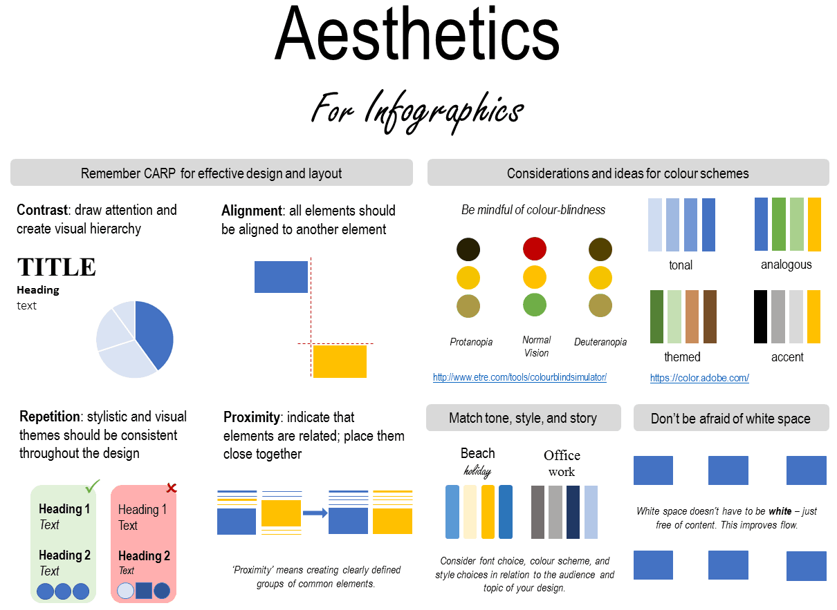
Aesthetics
The poster layout is clean and uses ample white space. The use of consistent and appropriate text formatting and pleasant colours make this poster easy to follow.

Good quality poster

Neatly presented but too much text

Text content
The text included is written concisely, though some duplicates the graphics content and includes too much detail.

Graphics content
The graphics are formatted clearly, though include some unnecessary information that gives text precedence in communicating the message.

Aesthetics
The poster is a little crowded, but clean.

Average quality poster

Excessive text and some formatting/colour issues

Text content
This poster includes too much text. Some sections include an excess of detail and are not written concisely. Text duplicates the graphics content.

Graphics content
Graphics are not used to communicate information other than results, and the figures are not formatted for ease of reading on a poster.

Aesthetics
Visual flow and clarity is reduced by use of colour and formatting. The contents of the poster are crowded.

Poor quality poster

Text is overwhelming, graphics confusing, and colour not used effectively

Text content
The text is excessive and complex, heavy with jargon and errors. Essential information is missing.

Graphics content
Figures and tables are difficult to interpret, with poor formatting and excess detail that detract from the key message.

Aesthetics
No thought has been given to layout, colour choice, or text formatting, resulting in a poster that is difficult to read and unpleasant to look at.
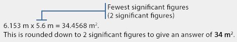
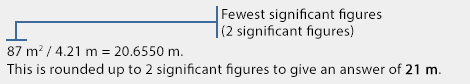
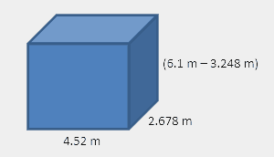
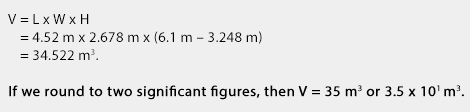
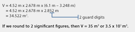
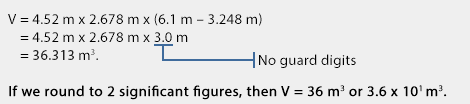
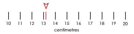
Poster visuals - figures and aesthetics

Graphics

Any graphs, diagrams, or images that you use in your poster should be easy to read and understand from a distance of at least 1 metre.

The graphics that you create for your poster should look different to those you would include in a report. Your graphics should be free from clutter, use colour to highlight important information, and only include information that supports your key messages.

View the examples below for more detailed information.


For more information on choosing the right type of graph, take a look at the CLIPS Displaying Data module.

Sizing and aesthetics

Considering colour choice, white space, and alignment on your poster will help ensure you are attracting and holding your audience’s attention. In other words, this is the stage where you review your poster draft and make sure it looks good!

You will need to exercise some individual judgement here, as every poster is different and the overall aesthetic will change depending on your content and graphics. A poster with well-written content won’t be noticed if it is aesthetically bland, but use caution – particularly with colour – or your audience will either find your poster hard to read or be distracted from your key message.

The image below highlights some important considerations for poster aesthetics and sizing.


Presenting your poster

Presenting a poster is a much more interactive experience compared to a standard PowerPoint presentation. Poster presentations give you the opportunity to have a short conversation with someone about your project and support your arguments with some visual aids.

The introduction
As a person approaches your poster you may be anxious to launch into a spiel about your project, however, it is a good idea to give them a moment to view your poster title first.
You may want to introduce yourself and ask them whether they would like you to talk about your project or if they would prefer to browse your poster.

A verbal summary
In case someone asks you to explain your project to them, you should have a short summary prepared that clearly illustrates what your project is all about. Depending on the content, you may want to highlight:

  1. The problem you were addressing
  2. What you were investigating
  3. How you approached the problem
  4. What you found
  5. Why your results are important
  6. Future research potential

Remember, you’re talking to a person – don’t read from the poster.

Your audience may know a lot about the topic or not much at all, so it’s best to keep the amount of jargon or technical terms to a minimum.

Using your poster visuals
If you’ve designed your poster properly, you should have a range of graphs, figures, or photos that you can use to help explain your project. When referring to your poster visuals, make sure you explain them to your audience – don’t just point and let them decipher it for themselves.

Answering questions
One of the benefits of a poster presentation is the opportunity to answer people’s questions. Make sure you listen to the question carefully and refer to any relevant visuals on your poster to help answer the question.Attempt to answer the question but don’t feel ashamed of saying you’re not certain. If you have absolutely no clue of a suitable answer, thank the person for their question and suggest it is something you will need to consider in more detail.

Appearance
You want the audience to concentrate on what you are saying, not on what you’re wearing. When giving a presentation your clothing should be respectable and comfortable.

Useful links

Science presentation skills by Atlant Bieri
Watch Video

Giving an effective poster presentation by George Hess
Watch Video

Designing conference posters by Colin Purrington
Visit website

Better Posters
Visit website

Creating presentations to communicate science

An introduction to PowerPoint presentations

PowerPoint should be used as a visual aid

PowerPoint presentations should be used as a visual aid that helps your audience to understand and remember the key details of your presentation.

Your audience want to hear you speak. They want to hear you explain your ideas, present results, or tell a story.

The human brain has a verbal and visual channel

When learning new material, there is a maximum amount of information that your brain can process at one time. We use visuals to help people to understand a concept. By using an image and talking about a concept, you are using both channels in the brain. Therefore, your audience will be more likely to understand and remember your message. However, many presenters mistakenly consider text on the screen to be visual information.

Text is not a visual aid

Text on the screen is processed by the verbal channel in your brain (think of the voice in your head when you’re reading). If you’re talking while people are reading your slides, your audience can be easily overwhelmed by too much information entering the verbal channel. A good PowerPoint presentation will use minimal text and instead concentrate on using speech and relevant visuals to communicate a message or explain a concept.

too much text can overwhelm the verbal channel

This module provides the information you need to plan, design, and construct a visually appealing science presentations that won’t overwhelm your audience.

 
Stage 1: Planning your talk
For assignments, your lecturer may require you to construct your presentation in a specific way. You should refer to your criteria sheet for more information. The assertion-evidence approach is still encouraged when designing your slides.

1. Have a clear purpose

Defining the purpose of your talk will help you to focus when you’re designing the content for your slides and when you’re giving your presentation.

Are you trying to explain, instruct, persuade, or entertain?

All effective communication needs a purpose.

At university the main purpose of many of your oral presentations will be to talk about research you have performed, using visuals to present your results and persuade the audience that your conclusions are valid.

2. Know your audience

While at university, your audience will often be your peers who have similar skills and knowledge. However, if you’re presenting information on a new topic, you need to ensure you present enough background information.

Thinking about your audience and considering how they may react to your talk will guide you when you consider what you are going to say in your presentation and how you will support your statements with visuals.

3. What are you going to say?

If you have determined your purpose and you know your audience, planning the content of your presentation will be much easier. Your talk should be comprised of only essential information that helps you to achieve your purpose.

The assertion-evidence approach

The assertion-evidence approach uses slide headlines to plan and present your presentation. Rather than using vague titles such as ‘introduction’ or ‘results’, the slide headlines will tell the audience exactly what the slide is about.

The headline is supported by a relevant images, graphs, diagrams, and limited amounts of text – not a list of bullet points or clip art. Your slide headlines will make up the main points of your presentation but it is up to you talk about the key message of each slide and provide more detail when necessary.

example of assertion-evidence slide

Planning template

Download the planning template

The ‘planning your presentation’ template will help you to structure your talk before creating your visual slides. The template’s 3-part structure can be used to create a range of presentations, from a brief project proposal to a more detailed conference talk.

The template provides space for you to write the headlines for each of your slides – one message per slide. Once you’ve entered in your headlines you can then transfer them to individual PowerPoint slides.

The template provides a column for a 5-10 minute talk and a 15-20 minute talk. For the longer talk, create 3 headlines that provide more information on each of the key points listed in the 5-10 minute column.

Stage 2: Creating your slides
poor slide examplepoor slide examplepoor slide examplepoor slide examplepoor slide examplegood slide examplegood slide examplegood slide examplegood slide examplegood slide example

Design Guidelines

Begin by placing your presentation headlines on blank slides and add any relevant images or graphs that clearly support the assertion in the headline. Don’t use vague section headings such as “methods” or “results”.

For headlines:

  1. Use a sans serif font (E.g. Calibri, Arial)
  2. Font size 36-40
  3. Maximum 2 lines

You can include small amounts of other text on the slide, if necessary, but avoid using bullet points. Bullet points are a bit like a shopping list – just a group of individual items with no story connecting them.

Use colour to highlight important features or differences

  1. Don’t use PowerPoint templates & backgrounds with designs or gradients.
  2. Use a light background with dark text or dark background with light text.

Graphs should be designed specifically for your presentation

  1. Focus on the important data. Leave out any data that does not help you to communicate the key message.
  2. Make the graph the main feature – not a decoration.
  3. Place labels on the graph – don’t use legends that your audience must decipher.
  4. Highlight interesting features with arrows or circles.
  5. Explain what the graph means.
For more information on choosing the right type of graph, take a look at the CLIPS Displaying Data module.

Images should support the headline assertion

  1. Don’t use clip art.
  2. Only use images that clearly support the headline assertion.
  3. Don’t use images to “add interest” to your presentation. If you’re not talking about the image, leave it out.
  4. Only use logos and institute information on the title and final slide.

Always double-check your slides for errors. If possible, have someone else look at your slides to check for errors.

Stage 3: Giving your presentation

Practice

It is essential that you practice your talk. Don’t just run it through your head or practice in front of the mirror – try to give your presentation in front of your friends or family.

Film yourself giving the presentation. This will allow you to identify any problems (E.g. Saying umm a lot, pacing, wild gestures, not making eye contact with the audience.)

Using notes

With adequate practice, you shouldn’t need to use notes during your talk. Reading from notes or palm cards means you’re not interacting with your audience. If you feel you need the support of notes, ensure that they are printed in a large font and broadly outline the message for each slide – don’t write a script.

Acknowledgements

Most people will end their talk by acknowledging their supervisors or colleagues. While it is important to acknowledge the help you received, it shouldn’t be the final message of your talk.
Acknowledgements and your contact details can be included on a final slide to be displayed after the applause and during question time. Your audience will still be able to see who was involved in your project without the anticlimax of reading out a list of names.

Timing

Never go over time. You should continue to practice your talk until you are sure you will complete your talk within the allocated time.

Answering questions

Answering questions from the audience can be a daunting experience but it is your opportunity to interact with the audience and clarify any specific points. Answering questions from the audience may require you to think critically about your research and address any possible limitations. Before giving your talk, it is worth thinking about areas of your talk that may attract criticism or require further explanation.

When answering questions you should:

  1. Listen to the question carefully.
  2. Let the questioner finish their question before you begin to answer.
  3. Ask for clarification if you’re not quite sure what they are asking.
  4. Attempt to answer the question but don’t feel ashamed of saying you’re not certain. If you have absolutely no clue of a suitable answer, thank the person for their question and suggest it is something you will need to consider in more detail or offer to discuss it with them after your talk.

Appearance

You want the audience to concentrate on what you are saying, not on what you’re wearing. When giving a presentation your clothing should be respectable and comfortable.

An academic explains

examples of first science presentationsdealing with nervesdesigning slides for science presentationsusing notes for science presentationskeeping to timeanswering questions in science presentations

Useful links

Creating effective slides: design, construction, and use in science
by Jean-luc Doumont
Watch Video Communicating Science to Non-scientists
by Jean-luc Doumont
Watch Video The assertion-evidence structure for PowerPoint slide design
by Robert Yale
Watch Video Designing effective scientific presentations
by Susan McConnell
Watch Video How to avoid death by PowerPoint
by David JP Phillips
Watch Video Make body language your superpower
by Stanford University
Watch Video

Writing to communicate scientific information

Editing your writing

Editing is an essential part of creating a clear and concise piece of writing. The editing process involves more than just correcting spelling errors or punctuation, it is an opportunity to rearrange sentences, improve the links between paragraphs, and increase the overall readability for your audience.

For all writing tasks, you should AT LEAST perform the following two checks:

Some of the examples in this section refer to fictional research involving zombie sheep and pug flatulence. Although we have had some fun with the examples, we are serious about improving writing skills.

We don’t joke about writing skills.

For more information on the fictional study, view the videos in the SAQ module and the examples in the poster module.

1. Check the structure

Have you included all the necessary sections for the genre? I.e. Introduction, methods, results, etc. Ensure you have used the correct headings and, if appropriate, used subheadings to divide sections into logical segments.

Your lecturer should provide you with details of what is expected for your assessment items. The information should include details on the type of writing task, the topic, what to include, and a word limit.

2. Check your paragraphs

Your paragraphs should create a logical flow of information or arguments. To check your assignment, write down the main point or topic of each paragraph and assess whether the topics create a coherent story. If any paragraphs jump from one topic to a completely unrelated topic, you may need to rearrange the order of your paragraphs or include extra paragraphs to improve readability. You should double-check that each paragraph is relevant to the heading or subheading (i.e. results should be in the results section).

You should have a logical flow within your paragraphs. In a similar way that paragraphs flow from one topic to the next, the paragraph sentences should guide your audience through your argument, explanation, or description.

Structuring your paragraphs

Basic paragraph

A paragraph is simply a collection of sentences that address a single topic. The basic paragraph structure includes a topic sentence or main point (often placed at the beginning) followed by supporting evidence, an explanation, more information or an analysis. This basic paragraph structure is known as the M.E.A.L format.

Not all paragraphs will fit the M.E.A.L format but it is a good foundation for the majority of paragraphs in introductions, discussions, and conclusion sections of scientific writings.

Structure of a basic paragraph

M: Main topic / claimE: EvidenceA: AnalysisL: Link to the next paragraph / conclusion
The first sentence indicates to the reader what the whole paragraph will be about. This main topic or claim can be something that you wish to explain or analyse, or a specific statement that you need to support with evidence.
Evidence is anything you use to explain or support the main topic or claim. Evidence comes in many forms and in science it often includes examples, and/or reference to your own or other people’s study results, and/or reference to published ideas or information.

The analysis section of a paragraph links the claim and the evidence. This section is your opportunity to explain to your audience why the evidence that you have provided supports the claim, or perhaps highlight the specific limitations of your evidence.

For example, why is the evidence you provided relevant to your main topic or claim? What are the limitations of the evidence you provided? What aspects of the evidence you provided do not apply in all situations? You do not need to present all of these analyses. The ones you use will depend on what your topic or claim is for that paragraph.

The final part of the paragraph can be used to provide a conclusion and/or a link to the next paragraph. This allows you to guide your reader from one claim or idea to the next and will help you to create a logical flow of information.

Argument paragraph

In scientific papers, the paragraph topic will often be stated as a claim or an argument. This is followed by sentences that include evidence from your own experiments or from another source. The evidence you provide needs to support the claim you have made in the topic sentence and ideally it should be accompanied by an analysis to highlight why the evidence supports your argument. The analysis section of your paragraph is the connection to your audience and the section where you can demonstrate your ability to use evidence to support an argument. The final sentence will often produce a link to the argument in the next paragraph.

The topic sentence of an argument paragraph is a doubted conclusion that is reinforced with evidence.

View biomedicine example
View ecology example

Explanation paragraph

A paragraph that is explaining a concept or a process usually begins with a topic sentence that is an accepted conclusion or a known fact. The sentences following the topic sentence connect a series of other accepted facts to illustrate the cause of something or explain how something works.

View biomedicine example
View ecology example

Extended argument paragraph

A paragraph in a scientific paper may not perfectly adhere to the M.E.A.L format. Some paragraphs may introduce a topic and provide evidence without an analysis or linking sentence. This can be useful when introducing a topic and leading your reader to your main arguments.

View biomedicine example
View ecology example

Rearranging your sentences

Editing your sentences can be one of the most effective ways to improve your written communication. During the writing process you may be focused on getting your thoughts down rather than paying close attention to sentence structure. This can result in unnecessarily wordy or confusing sentences.

Keep subjects and verbs close together

By placing the subject and verb close together, your audience can understand your sentences much more easily, particularly when you are addressing complex scientific topics.

Blue: subject

Red:verb

Example

Zombie sheep in areas where control measures are insufficient or absent threaten the futures of farming communities.

This sentence takes 9 words before we know what the subjects (the zombie sheep) are actually doing (threatening the futures of farming communities).

To improve the readability of your sentences, you should try to keep the subject/s and the verb as close as possible. This may not be an easy task when the sentence is describing complex scenarios or using multiple scientific terms.

Improved example

Zombie sheep threaten the futures of farming communities in areas where control measures are insufficient or absent.

The sentence could also be reworked to use the passive voice, with a focus on the farming communities:
The futures of farming communities are threatened by zombie sheep in areas where control measures are insufficient or absent.

Place unfamiliar information at the end of sentences

To improve cohesion within a paragraph, you should try to link the end of one sentence with the beginning of the next sentence. You can link sentences by placing familiar information at the beginning of a sentence and unfamiliar information at the end.

If you maintain this “familiar information -> unfamiliar information” structure throughout your paragraphs you will gradually expose your audience to new information or arguments, thus avoiding confusion.

Purple: familiar information
Green: unfamiliar information

Example

Poor cohesion:
The Pug is a small breed of dog that originated in China. Pugs became popular among the European nobility in the 16th century after they were imported from China.

Better cohesion:
The Pug is a small breed of dog that originated in China. Pugs were exported from China to Europe in the 16th century and became popular among the European nobility.

The second option above provides better cohesion between the two sentences because of the familiar -> unfamiliar sentence structure.

Check your sentences and, if necessary, rearrange them to place unfamiliar information at the end of sentences.

Active vs. passive voice

Active voice: when the subject is a person or a thing performing an action.

Passive voice: when the subject is something being affected by an action.

Blue: subject

Red: verb

 SubjectVerbObject 1Object 2
Active voiceBettydroppedthe acidon the floor.
Passive voiceThe acidwas droppedon the floorby Betty.
Pasive voice w/o objectThe acidwas droppedon the floor. 

These three sentences say exactly the same thing but in the passive sentences the focus has shifted from Betty to the acid.

When to use passive voice

Using the active voice is encouraged in scientific writing; however, there are situations where using the passive voice is more appropriate.

1. Changing the focus of a sentence to maintain cohesion.

Active voice: Approximately 67% of the global sheep population are classed as zombies. Each year, governments destroy millions of zombie sheep in an effort to reduce the population.

Initially the focus is on zombie sheep but then shifts to governments in the second sentence.

Passive voice: Approximately 67% of the global sheep population are classed as zombies. Each year, millions of zombie sheep are destroyed by governments in an effort to reduce the population.

In both sentences the focus remains on zombie sheep, resulting in good cohesion.

2. When the subject is unknown or irrelevant.
(I.e. a methods section)

Active voice: We added 1 µl of pug flatulence extract to the neural cell culture.

The ‘we’ in this sentence doesn’t provide anything meaningful to the sentence.

Passive voice: 1µl of pug flatulence extract was added to the neural cell culture.

This sentence removes the superfluous ‘we’ and focuses on the pug flatulence extract.

3. When the subject is too long.

Active voice: The zombie sheep neural cell sample exposed to high doses of hydrogen sulphide showed high rates of mortality.

This sentence uses far too many words before the action word is reached. This can result in an audience getting lost in the sentence before they understand the meaning.

Passive voice: High rates of mortality were shown by the zombie sheep neural cell samples exposed to high doses of hydrogen sulphide.

In this sentence, the audience is cued to think about high rates of mortality before reaching the lengthy section referring to the zombie sheep neural cells. By simply changing the subject, the sentence is easier to understand.

Nominalisations

What is a nominalisation?

Nominalisations are verbs that are modified to create nouns. They are common in scientific writing and are often used to make a sentence sound more scholarly.

Unfortunately, using nominalisations can turn a simple sentence into a wordy or confusing sentence. Therefore, a nominalisation should only be used if it improves a sentence.

When to use a nominalisation

Nominalisations should be used in moderation. While some nominalisations may be field-specific and refer to a familiar concept, you should only use a nominalisation if it will help your audience to understand your message.

1. Maintaining paragraph cohesion (E.g. “The neural cell cultures were incubated at 37 oC for 1 hour. Each incubation was conducted in triplicate.”)

2. Using field-specific terminology (E.g. fragmentation, destabilisation, regulation, fertilisation, incubation).

3. Reducing lengthy sentences (E.g. “The fragmenting of an ecosystem” becomes “ecosystem fragmentation“)

Unnecessary nominalisations

Blue: subject
Red: verb
Green: nominalisation

We analysed the data…”
using a nominalisation becomes
We performed an analysis on the data…”

We investigated the cause of…”
using a nominalisation becomes
We conducted an investigation into the cause of…”

Examples

The following examples demonstrate how the type of voice and the use of nominalisations can affect the readability of a sentence. For these examples, the sentences using the active voice with no nominalisations are generally clearer and more concise. However, as discussed in the “active vs. passive voice” section, this will not always be the preferred option.

Talking about a scientific study

Active voice: We investigated how egg consumption affects the concentration of hydrogen sulphide in pug flatulence.

Passive voice: How egg consumption affects the concentration of hydrogen sulphide in pug flatulence was investigated.

Active + nominalisation: We performed an investigation on how egg consumption affects the concentration of hydrogen sulphide in pug flatulence.

Passive + nominalisation: An investigation on how egg consumption affects the concentration of hydrogen sulphide in pug flatulence was performed.

Talking about results

Active voice: A high-egg diet increased the concentration of hydrogen sulphide in pug flatulence.

Passive voice: The concentration of hydrogen sulphide in pug flatulence was increased by a high-egg diet.

Active + nominalisation: A high-egg diet caused an increase in concentration of hydrogen sulphide in pug flatulence.

Passive + nominalisation: An increase in concentration of hydrogen sulphide in pug flatulence was caused by a high-egg diet.

Talking about methods

Example 1.

Active voice: The participants consumed a no-egg, low-egg, or high-egg diet.

Passive voice: A no-egg, low-egg, or high-egg diet was consumed by the participants.

Active + nominalisation: The participants were allowed the consumption of a no-egg, low-egg, or high-egg diet.

Passive + nominalisation: The consumption of a no-egg, low-egg, or high-egg diet was allowed for the participants.


Example 2.
Active voice: We added 1 µL of pug flatulence extract to the neural cell culture.

Passive voice: 1 µL of pug flatulence extract was added to the neural cell culture.

Active + nominalisation: We performed the addition of 1 µL of pug flatulence extract to the neural cell culture.

Passive + nominalisation: The addition of 1 µL of pug flatulence extract to the neural cell culture was performed.

Useful Links

Websites

Duke University scientific writing resource
View website

Bates College – how to write a paper
View website

Purdue online writing lab
View website

11 steps for writing a paper
View website

MEAL writing method
Watch video 1
Watch video 2

Judy Swan – Scientific Writing: Beyond Tips and Tricks
Watch video

Books

The Norton field guide to writing @ UQ Library OR View website

Scientific writing = thinking in words @ UQ Library

Writing science @ UQ Library

Scientific English a guide for scientists and other professionals @ UQ Library

A short guide to writing about biology @ UQ Library

Science communication: a practical guide for scientists @ UQ Library

Creating scientific graphs and tables

Communicating results with scientific graphs

Graphs are great visual communication tools that, when used correctly, can consolidate large amounts of data to help identify patterns and relationships for an audience. Whether they are included as part of a scientific article, a presentation, or a poster, scientific graphs should help you to communicate the key messages or findings of your investigation.

Before you create a graph you should consider three things:

1. Do you need a graph?
Sometimes results can be easily summarised in a sentence or two, or by using a simple table. If you have a large number of categories with a variety of measurements, a table may be more appropriate to neatly display results.

2. What types of variables do you have?
Knowing the types of variables in your data and the statistical analysis you have performed will guide you when deciding what type of graph to use.

3. What is your message?
Graphs should clearly communicate a message to your audience. Therefore, you should only include data that will help communicate your message (while ensuring you’re not misleading your audience). You should keep this message in mind when creating and formatting your graph.

Graphs share common features that help your audience to understand your key message.

As a general rule, you should ensure that all of your figures for scientific articles or lab reports can be easily interpreted when printed in black and white. Colour can be used if your audience is likely to view the graph in colour (i.e. when viewing a poster or presentation) or if it essential to communicate your message.

parts of scientific graphs

How to display your data

parts of a line graphparts of a scatter plotparts of a histogramparts of a bar graphparts of a box plotparts of a pie chart

Pie charts are rarely used in scientific articles, but they can be useful when communicating with the public. You should check the requirements of your assignment with your lecturer for guidance on how to display your data.

Types of variables

Continuous variable: Continuous variables are numeric measurements or observations that can include any number of values within a certain range. (E.g. temperature, time, weight, and concentration).

Discrete variable: Discrete variables are measured as whole units. (E.g. number of birds in a population, number of students in a class).

Categorical variable: Categorical variables describe a quality or a characteristic (E.g. Colour, species, sex, blood type).

Independent variable: The independent variable is the variable which you control or manipulate in your experiment, or the variable that you think will affect the dependent variable. Independent variables are placed on the x-axis of a graph.

Dependent or response variable: The dependent variable is the variable you think will be influenced by the independent variable. Changes in the dependent variable are observed or measured in relation to changes in the independent variable.

Example:

An experiment investigating the effect of light exposure on the rate of growth of a plant.

The independent variable is the amount of light exposure and the dependent variable is the rate of growth.

Should I use a table?

Sometimes a table will be more appropriate for displaying your data. Tables are great for displaying multiple variables, specific values, and comparing categories. A table will often require an audience to look up specific information to understand the data. Therefore, you should ensure your table is presented in a neat and logical manner.

It is important that you don’t just add all of your raw data to your tables. Similar to graphs, you need to consider the message in your data that you want to communicate to your audience. You may need to perform a statistical analysis on your data or summarise your results before adding the information to a table.

For large tables, you may need to shade alternate rows or highlight important details by using a bold font to allow your audience to read the table efficiently.

parts of a scientific table

Figure & table legends

All of the tables and graphs that you create for scientific articles and lab reports will require a legend.

What is the point of a legend?

  • Identifies the graph or table (E.g. Figure 1. or Table 1.)
  • Informs your audience what the graph/table is showing
  • Provides any information that may be needed to interpret the graph/table
  • Some figure legends may need to include information on specific symbols or shading, the experimental methods, the error bars, or the sample size. For tables this information can be included in column/row headings or as footnotes.

The concise description in a table or figure legend should convey the key message of the table or graph to your audience without having to read the full article.

This module focuses on graphs and tables for use in scientific articles and lab reports. If you are designing a graph for a presentation or poster, you should refer to the relevant module for further design guidelines.

For detailed guidelines on creating figure legends, view the optional extras section below.

The essentials

Figure number (Figure 1 or Fig. 1)
You must refer to all figures in the main text of your report or essay. The figure number is used to allow your audience to find the figure you have referred to in your text.

Figure title
Figure titles can be descriptive or assertive.

A descriptive figure title briefly describes what the figure is displaying but lets the reader identify any trends or relationships, or is guided by the text you include in the results section. An assertive title can be used to identify a specific trend found in a graph or highlight the key message of a diagram.

Assertive titles can help your audience to quickly identify the key message contained within your figure but you should ensure your title does not mislead your audience or overstate your results.

Example 1.
Descriptive: Figure 1. Effects of dam construction on fish biodiversity.
Assertive: Figure 1. Dam construction results in loss of fish biodiversity.

Example 2.
Descriptive: Figure 2. Height distribution of two Eucalyptus grandis plantations in Queensland.
Assertive: Figure 2. Insect defoliation of Eucalyptus grandis reduces canopy height.

Figure legend examples

example figure legendexample figure legendexample figure legendexample figure legend
Figure legend – optional extras

Including any of the following optional extras will depend on what is displayed in the figure and what you feel your audience needs to understand the figure. The optional extras you include will also depend on what information you have included in your methods and how you refer to the figure in your results section.

View the examples above to see how the optional extras are used to describe a variety of figures.

You should check the requirements of your assignment or discipline for guidance on which optional extras to include in your legend.

1. Symbols, lines, colours & acronyms

If you have used symbols, lines, colours or acronyms in your figure that have not been identified on the actual figure, you need to ensure they are referred to in the figure legend. If you have used colour in your figure, make sure your audience will be able to view it in colour, otherwise the figure will be difficult to interpret.

Example
Oxygen consumption rate for Fish species 1 (filled circle) and Fish species 2 (hollow circle).

2. Means and error bars

If you are plotting mean values and including error bars, you need to state this in the figure legend.

Example
Mean trunk diameter (+\- SEM) of Eucalyptus grandis.

3. Statistical information

Some figure legends will mention the type of statistical test used, the sample size, p-values, or other statistical information. The inclusion of this type of information often depends on personal preference or editorial guidelines.

However, it can be useful to include this type of information in figure legends to help communicate the validity of your results to your audience.

Example
Statistical analyses were performed using ANOVA with a Tukey’s post-test (***, p<0.0001; **, p<0.001; *, p<0.05; ns, not significant).

The sample size is often included in a figure legend when comparing two or more groups with varying sample sizes.

Example
Height distribution of two Eucalyptus grandis plantations in Queensland. Western ridge N = 350, Eastern ridge N = 300.
Whether you decide to include this type of statistical information in your figure legend or not, you must ensure it is included the text of your methods and results section.

4. Experimental information

Including specific experimental information in your figure legend can help your audience to distinguish between groups included in your figure.

For example, if you have labelled 3 different treatment groups using abbreviations, you should include more information on how the treatment groups vary. Obviously this information will be available in your methods sections but it will help your audience to understand the figure.

Example
The control (pH 5.3) was normal city tap water. The pH 3.5 and 2.0 water was acidified with 2 M sulfuric / 1 M nitric acid solution.

5. Compound figures

Compound figures can be used to display multiple related graphs or diagrams. Compound figures are useful when comparing results that can’t be contained within a single graph or diagram.

Compound figure legends still have a single figure label and title but each individual figure should be labelled (A, B, C, etc.), with a brief description of each provided in the figure legend.

6. Referencing

If you have obtained a figure from another source (rather than creating your own) you must create your own figure legend and cite the author.

Example
Agricultural water use, by state 2013-14. Reproduced from Australian Bureau of Statistics (2015, p.18).
If you modify a figure, you should mention that it has been adapted from the source.

Example
Agricultural water use, by state 2013-14. Adapted from Australian Bureau of Statistics (2015, p.18).
Ensure that any citations in figure legends match the referencing style that you have used throughout your document. Any sources cited in figure legends must be included in your references section.

An Academic Explains

choosing the right scientific graphformatting scientific graphscreating a scientific figure legendwhen to use scientific graphs

Useful links

Choosing the right graph
Extreme Presentation
Download PDF

Statistics for biology and agricultural science
by Ploughing Through Biometry
Visit website

Real chart rules to follow
by Flowing Data
Visit website

Short-answer questions in science

Answering short-answer questions

Analysing the question

Short-answer questions provide an opportunity for you to show that you have an understanding of the concepts in a subject. You should be able to remember a range of definitions and facts as well as explain/analyse more complex concepts and solve problems.

The amount of detail that you provide in your answer will depend on what you have been taught during your course. The number of marks assigned to the question is another indicator of how much detail is expected.

Before you begin to answer a question, it is best to analyse the question first so you are clear about exactly is being asked.

Follow this 5-step process for SAQs.

  1. Deconstruct the question.
  2. Identify content words.
  3. Identify task words.
  4. Write your answer.
  5. Check you’ve answered all parts of the question.

1. Deconstruct the question

Many short-answer questions will already be divided into parts (I.e. a, b, c) but it can be helpful to deconstruct the question further to ensure you answer all parts of the question. You can number each part or re-write in your own words.

For calculations: Questions in some fields (e.g. physics and chemistry) may have problem-solving questions that require you to perform a calculation. Your first step should be to extract all the values from the question that you will need to solve the question. It can be useful to draw a diagram and label it with the values from the question.

Example
Q. Identify an organ that removes alcohol from the bloodstream and describe the process involved.

You could divide this question into 2 parts: the first part is the name of the organ and the second part provides the description.

  1. Name of organ
  2. Description of process

2. Identify content words

The content words of a question indicate what information should be included in your answer.It is useful to underline each of the content words so you can quickly confirm you have referred to all the necessary information in your answer.

For calculations:
Identify the equations you will need to solve the problem and copy them from your formula sheet (if applicable). Sometimes you will need to convert the values you’ve been given to the correct units or use several different equations before you can find the final answer.

Example
Q. Identify an organ that removes alcohol from the bloodstream and describe the process involved.

3. Identify task words

Task words tell you how you need to present your answer and how much information you should include. Circle or highlight each of the task words in the question and use these to construct your answer.

You should have a good understanding of the variety of task words used in short-answer questions.

Download the task words list

Example
Q. Identify an organ that removes alcohol from the bloodstream and describe the process involved.

4. Write your answer

Once you have deconstructed the question and identified the content and task words, you can begin to answer the question.When writing your answer, whether it requires dot points, sentences, or calculations, you should present you answer in a neat and logical manner.

Make it easy for your lecturer to follow!

You should provide as much information as you think the question requires, but try to keep it concise. The task words will give you an indication of what is required.

Remember, SAQs are your opportunity to show your lecturer what you know and understand. Don’t be afraid to include specific terms or draw diagrams if it helps you to answer the question.

For calculations:
Make it clear to your lecturer what you are doing. Use words to label and link different parts of your calculation. Ensure that you use the correct units and have used the correct number of significant figures.

Example

  1. The liver.
  2. An enzyme in the liver, alcohol dehydrogenase converts ethanol to acetaldehyde. Acetaldehyde is then converted to acetic acid by another enzyme, aldehyde dehydrogenase. Acetic acid is used in a range of metabolic pathways and can be broken down into water and carbon dioxide.

OR

The liver is responsible for removing the majority of alcohol from the bloodstream using two enzymes: alcohol dehydrogenase and aldehyde dehydrogenase.


5. Check your answer

It is very important to check your answer once you have finished writing it. Compare your answer with the question and the content and task words you identified at the beginning.

Have you answered the question?

An academic explains

Example SAQs

The following examples are designed to show you how short-answer questions can vary in style and complexity. The examples should not be used for revision or as practice questions for your courses.